Giving the Calendar a makeover
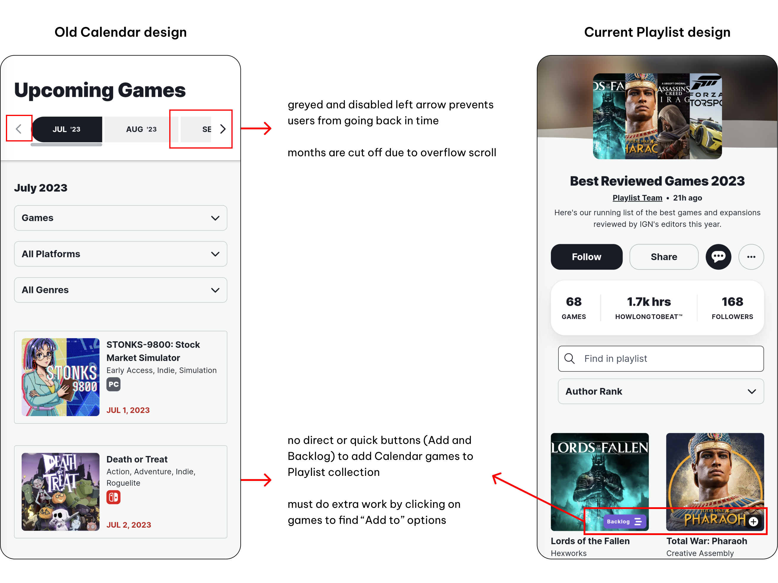
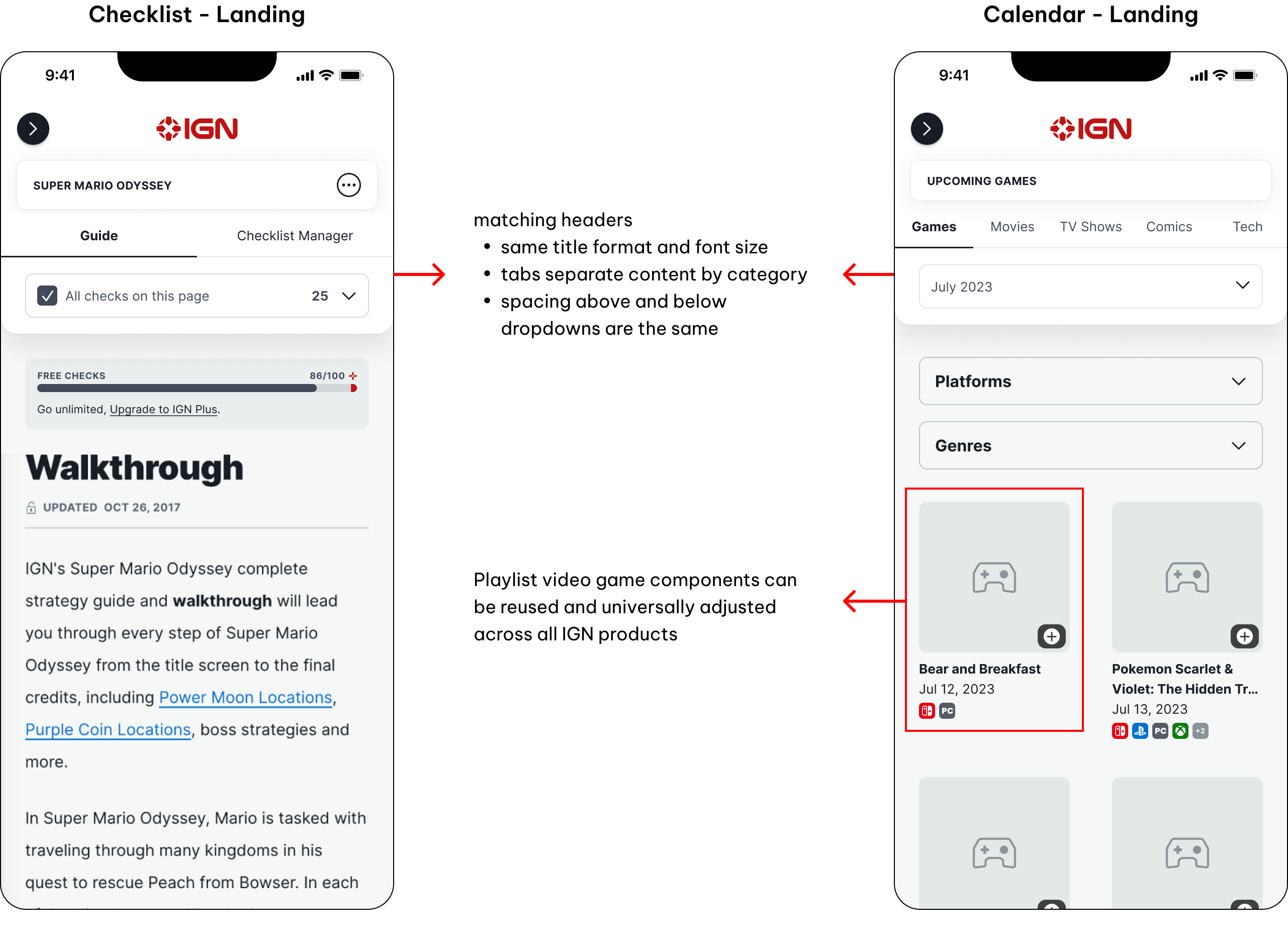
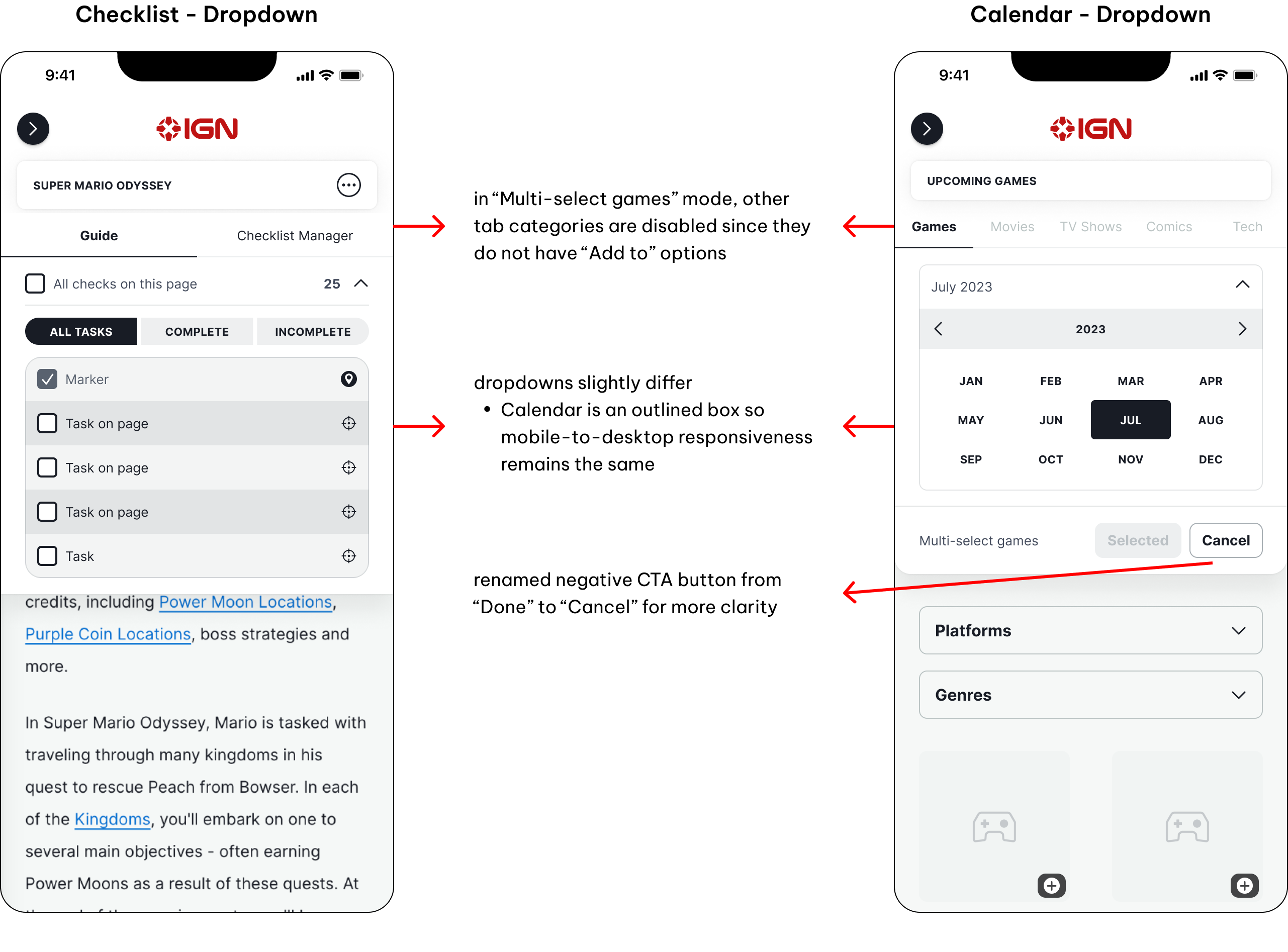
IGN's "Upcoming" pages is a release schedule for media (video games, movies, TV shows, etc.) set to come out this year. However, the Calendar's user experience prevented users from viewing past releases and lacked a direct funnel to Playlist, an IGN product where users can manage and track their video game collection. The UI needed to match Playlist for consistency and cohesiveness across the website.

A constant iteration process
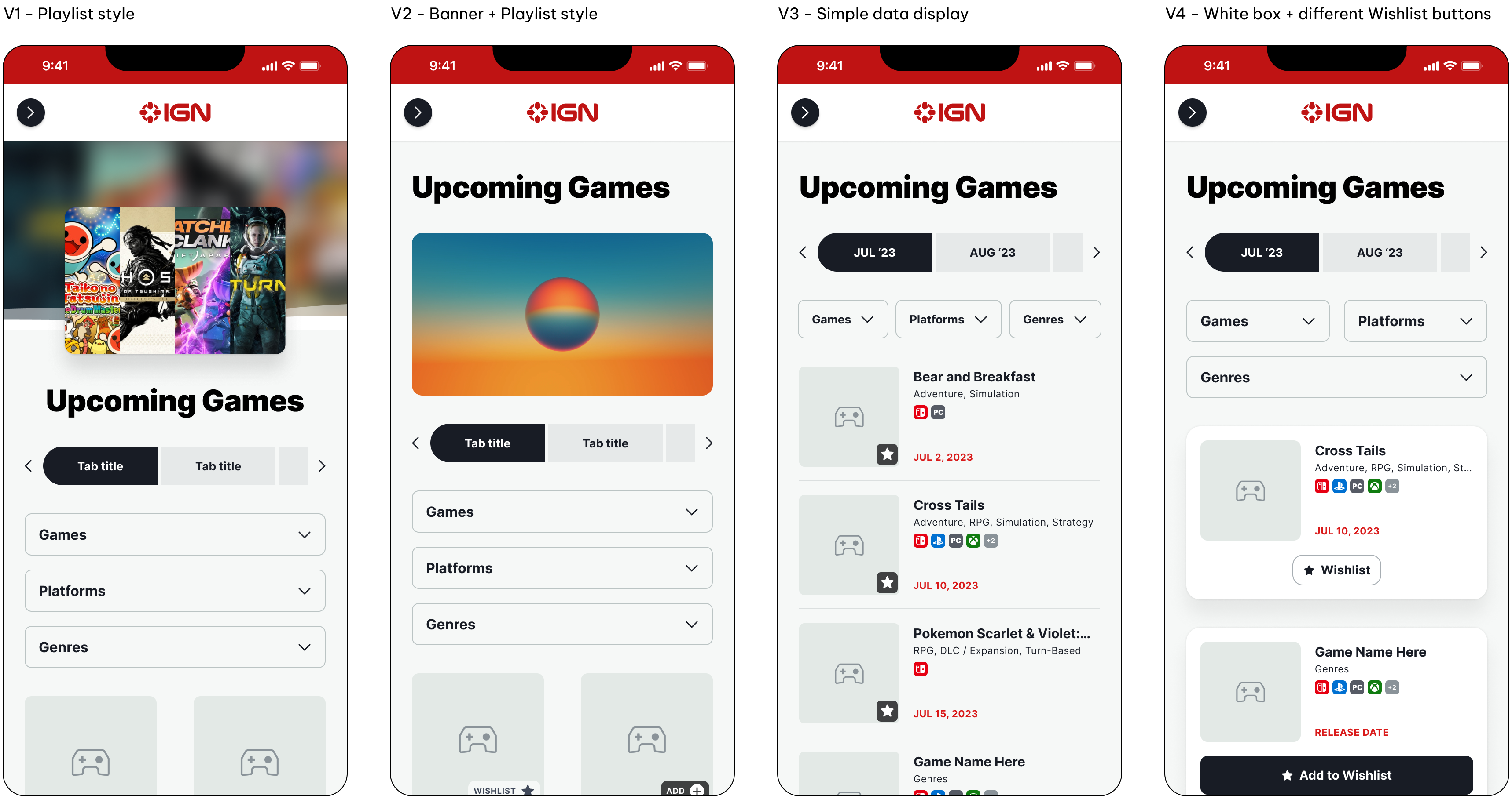
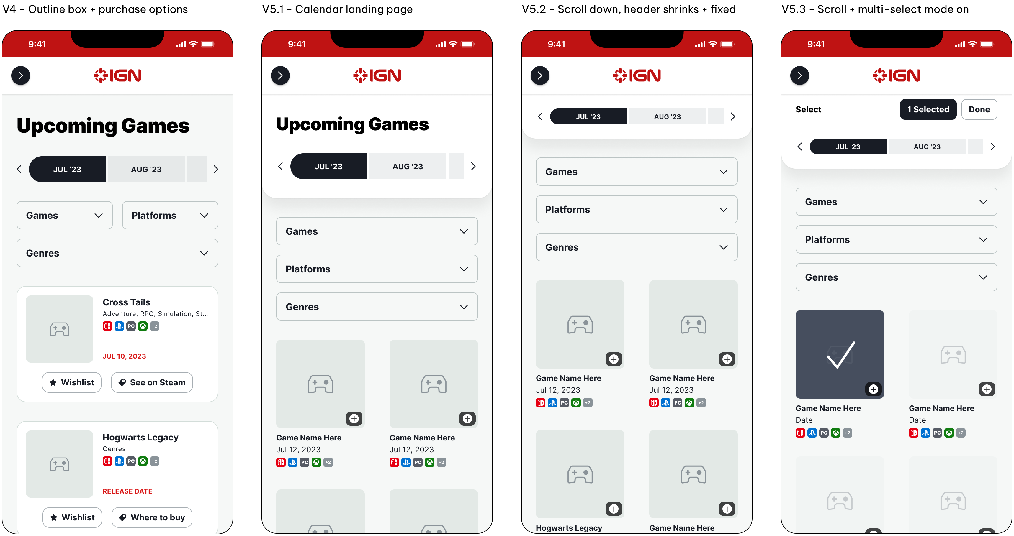
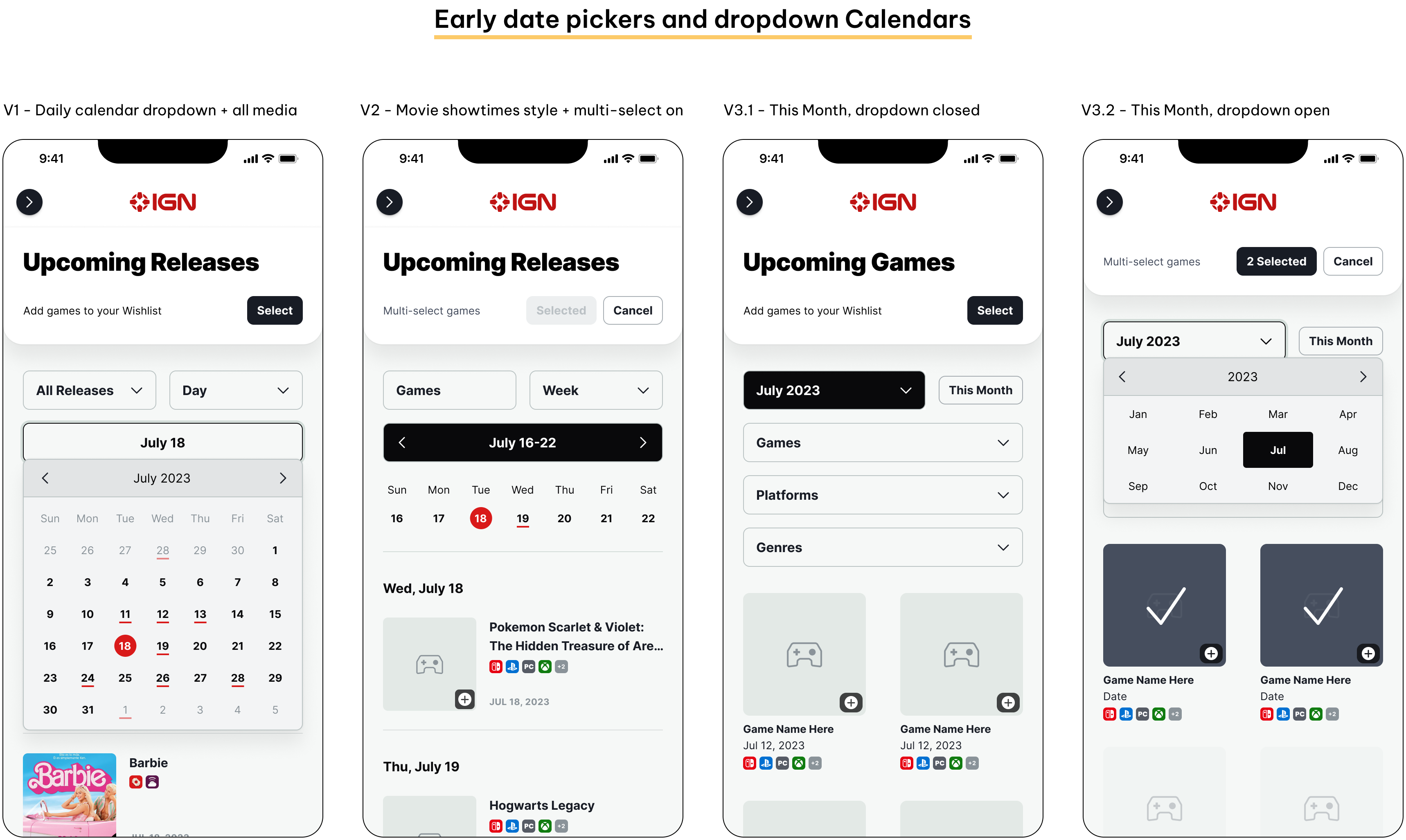
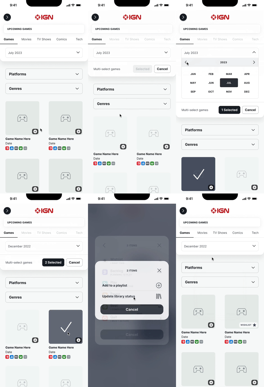
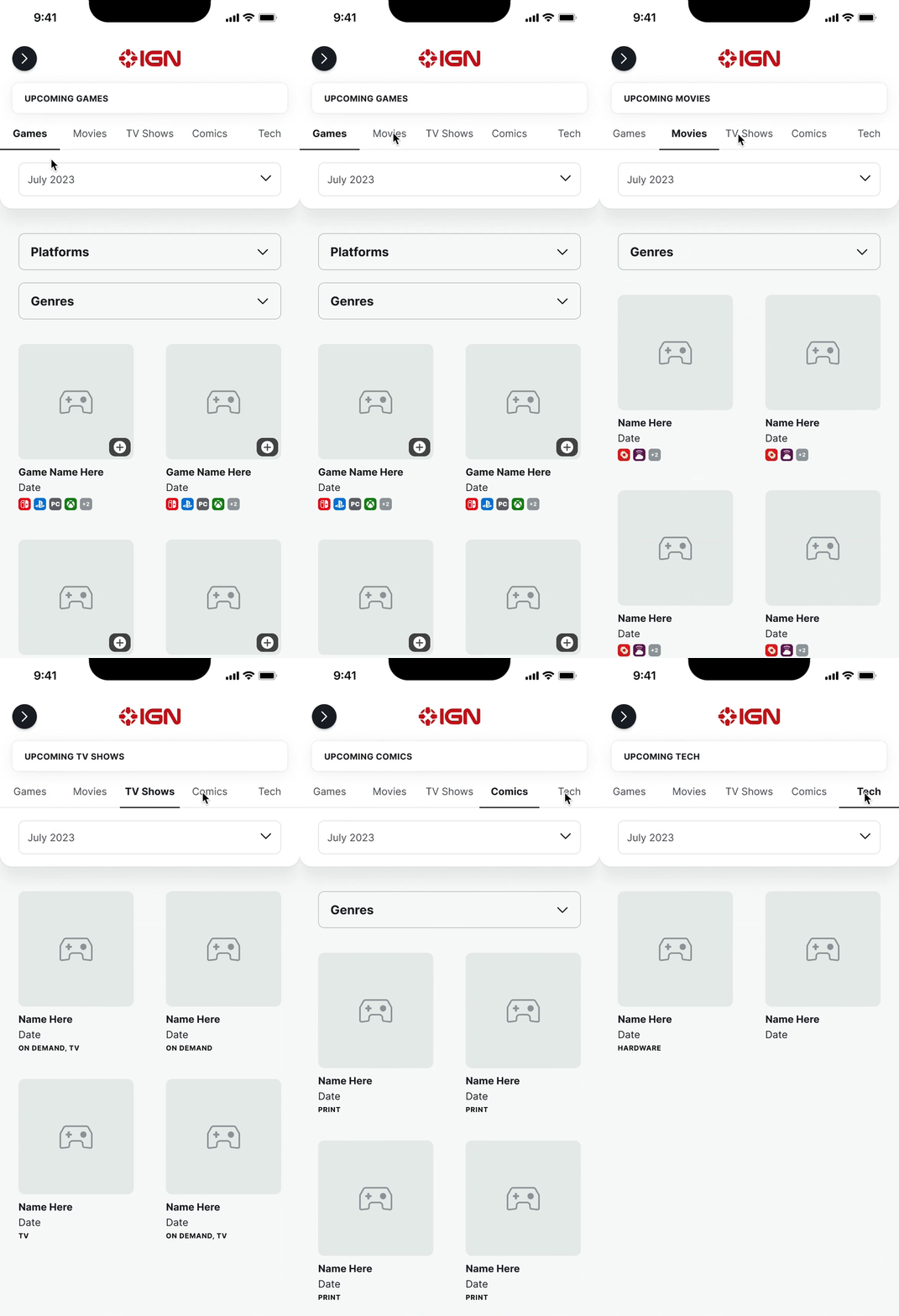
Since most IGN users are mobile users, I took a mobile-first approach and explored various iterations that reflected Playlist, and experimented with how to display video game data and CTA buttons related to Playlist's features, such as Wishlisting.


During early feedback sessions, my Product team preferred Version 5 (V5.1-V5.3) the most due its simplicity, resemblance to Playlist, and consideration of screen space. However, they disliked the "pill-shaped" calendar navigation bar since it impeded efficient navigation and did not resemble conventional calendars.
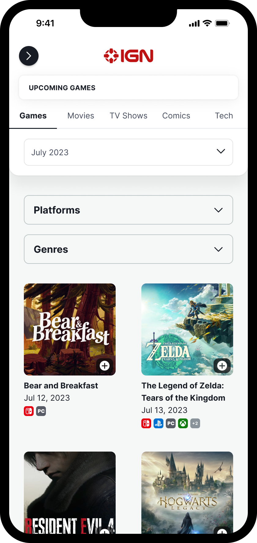
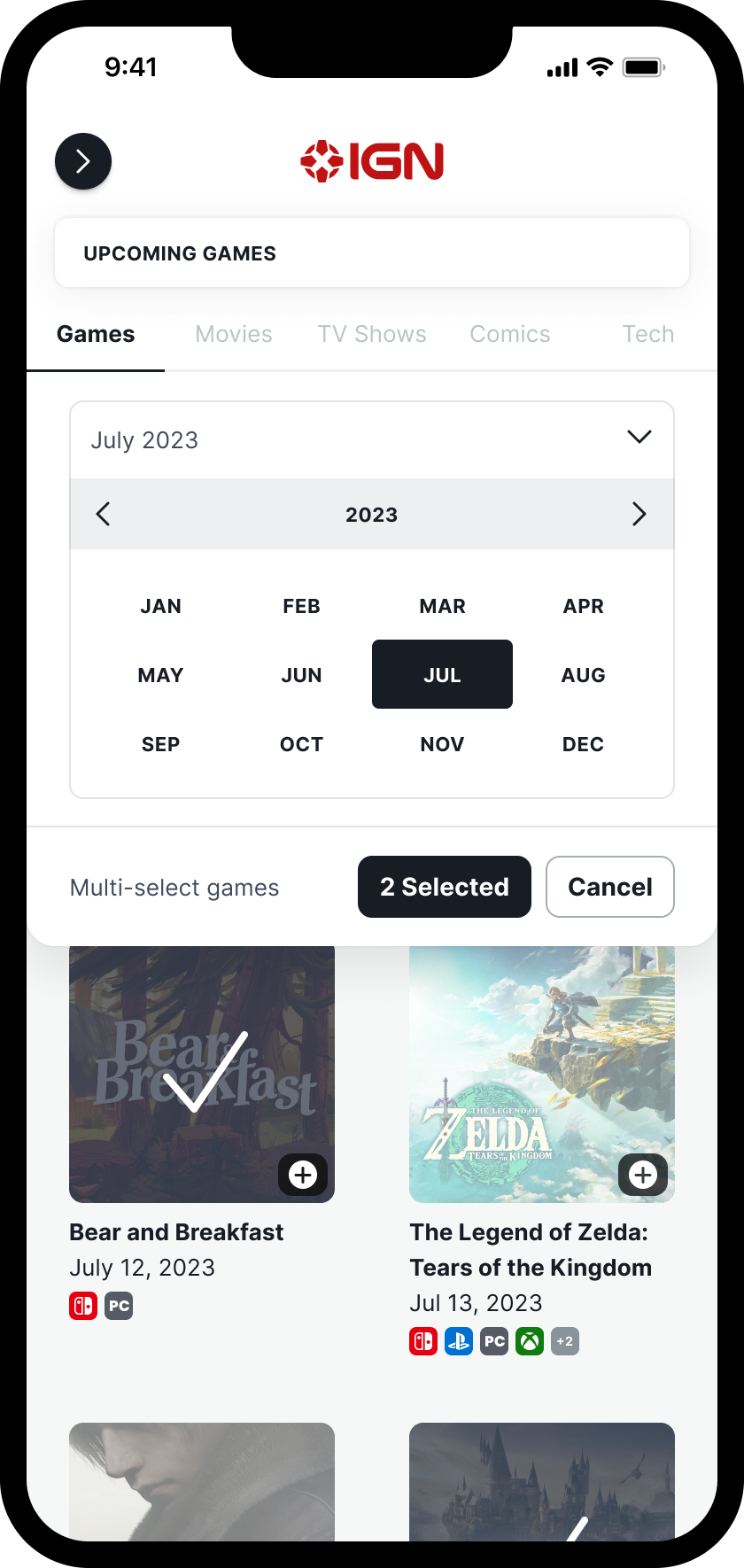
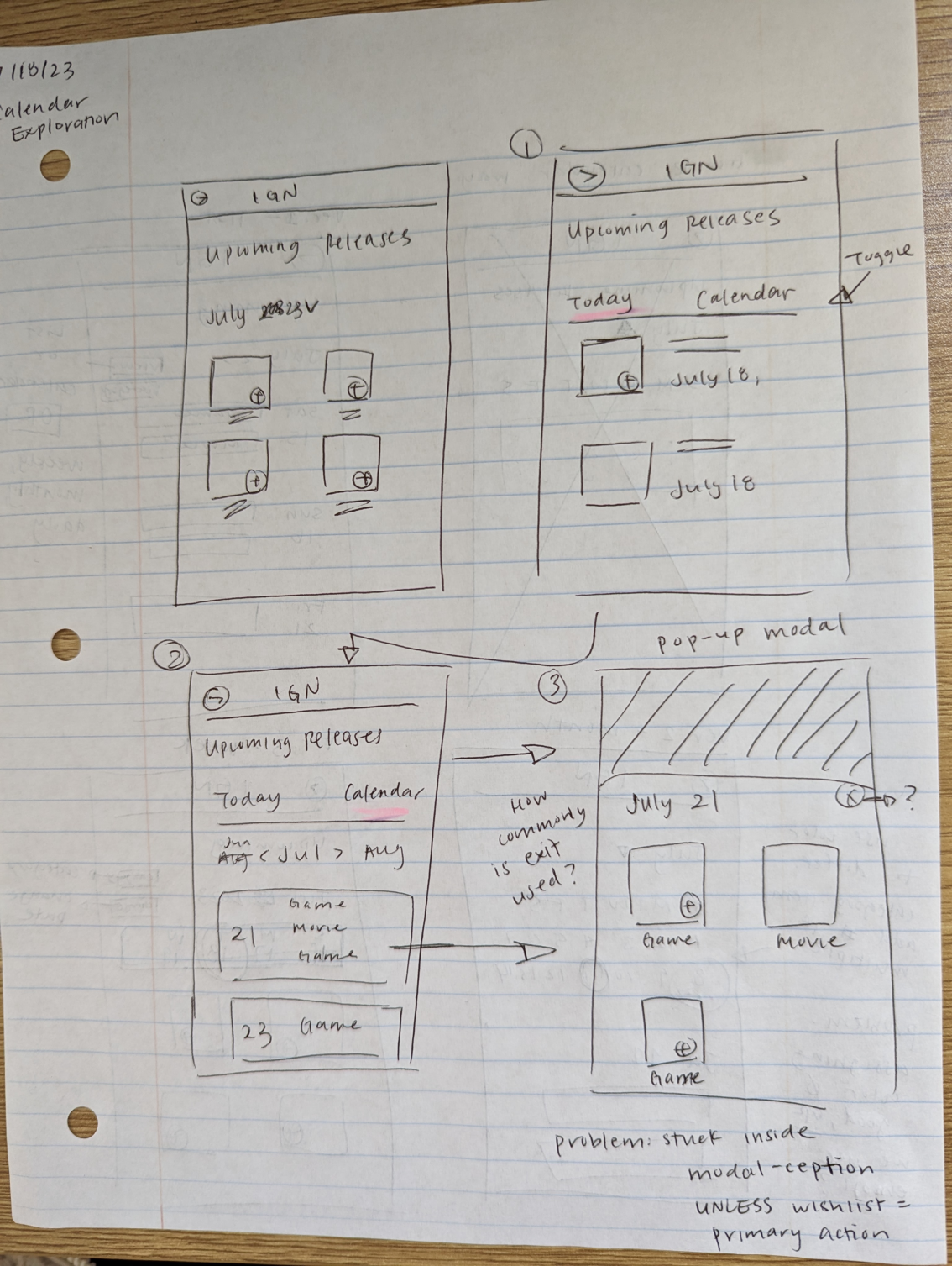
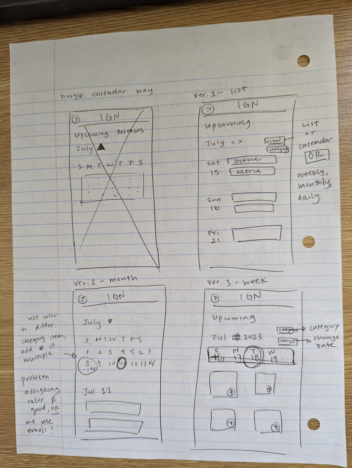
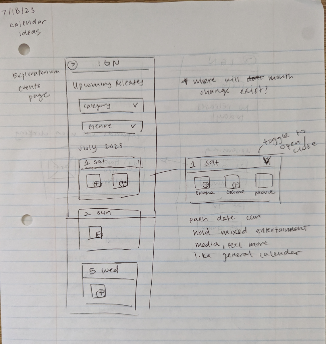
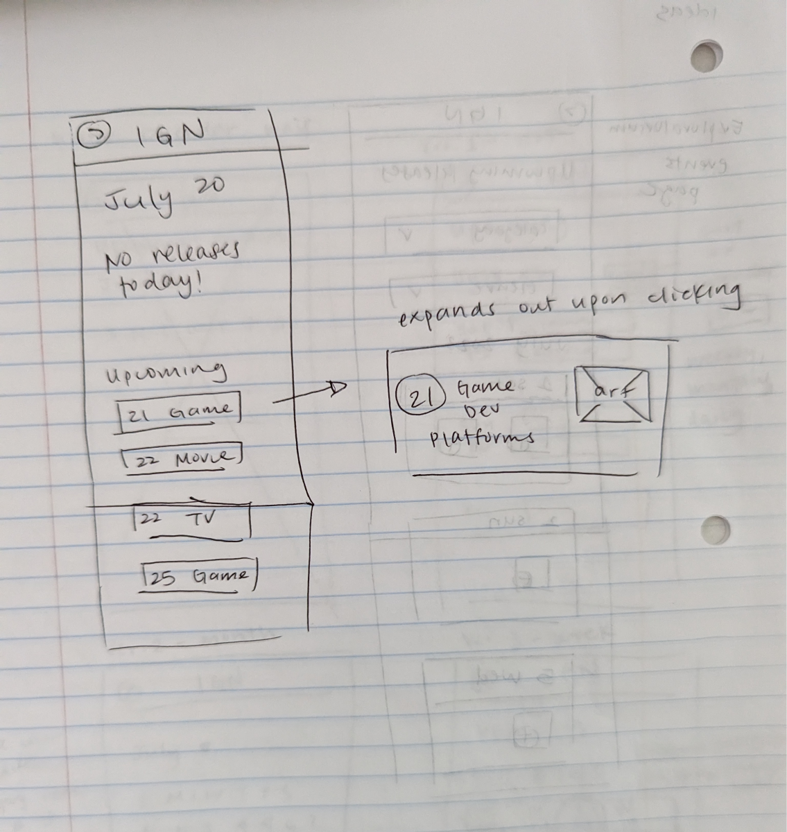
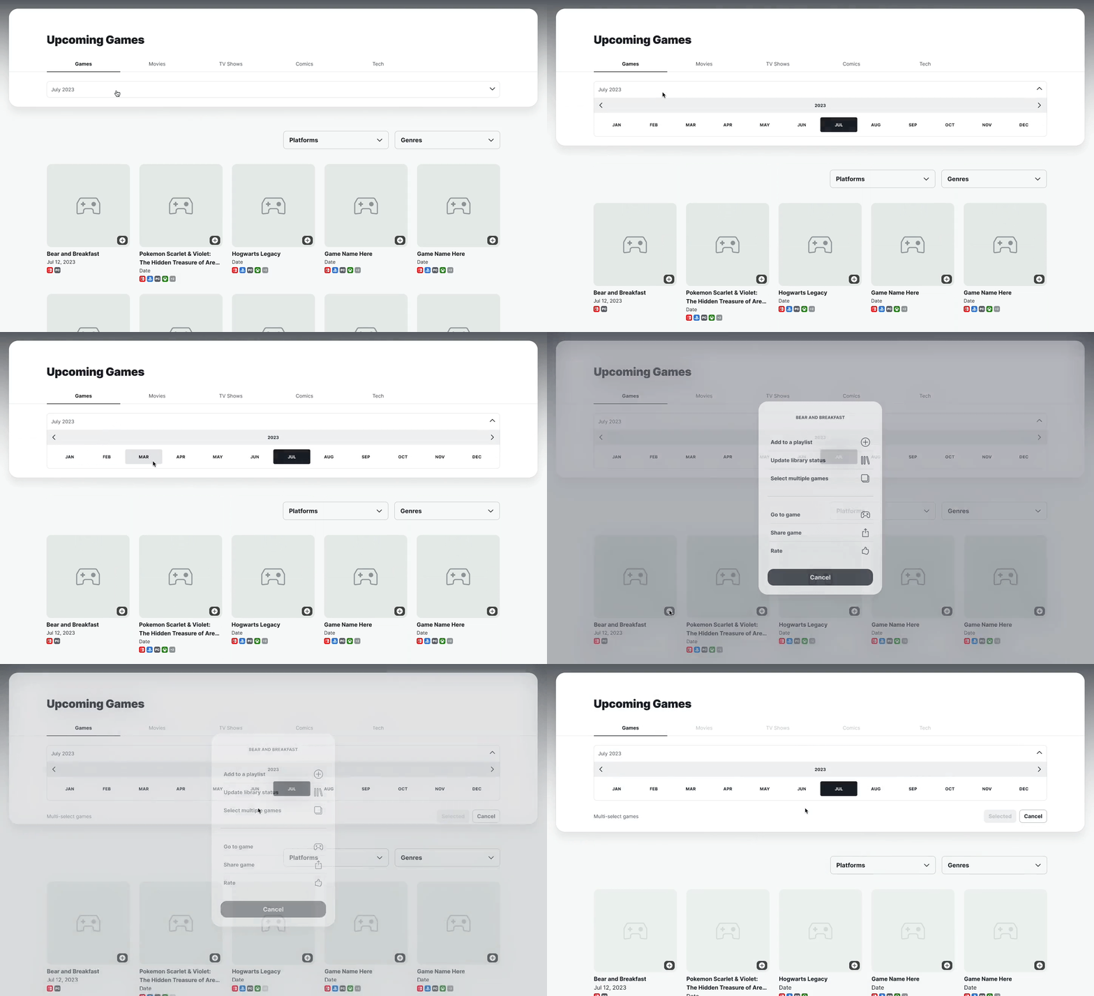
Thus, I sketched out new calendar layouts that prioritized selective date-picking to give users more freedom and autonomy over their navigation experience. I gained inspiration from showtimes on movie apps, flight schedulers, mobile calendars, and museum event calendars.

Future trajectory of The Icon Awards
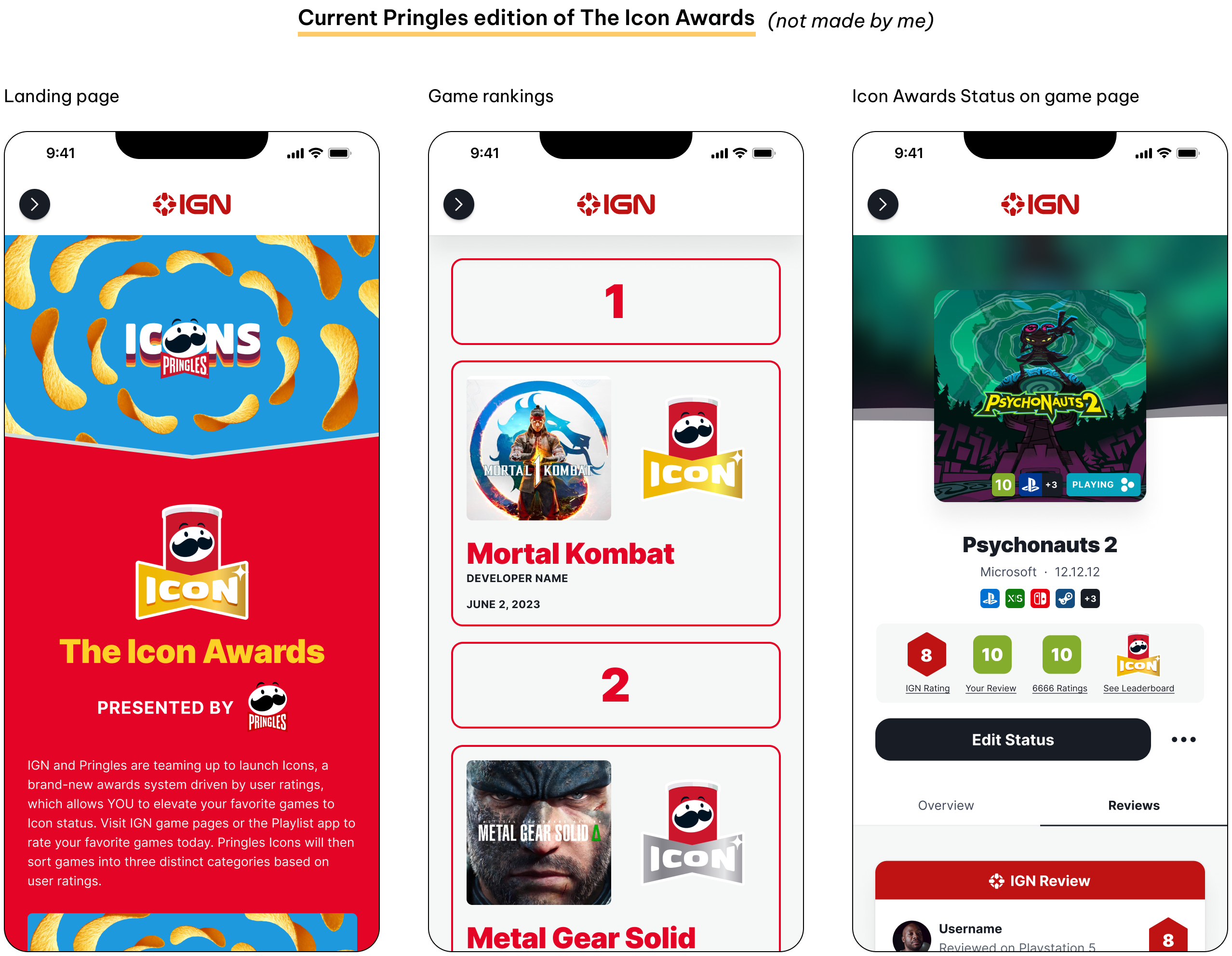
The Icon Awards is a current initiative sponsored by Pringles, which highlights the top games of 2023 based on aggregated user game reviews made by IGN users. The Product and Sponsorship teams hoped to continue this in the future to drive more user game reviews, with or without sponsors, so I conceptualized ideas of what it could be, and focused on expanding its promotional reach throughout the website.

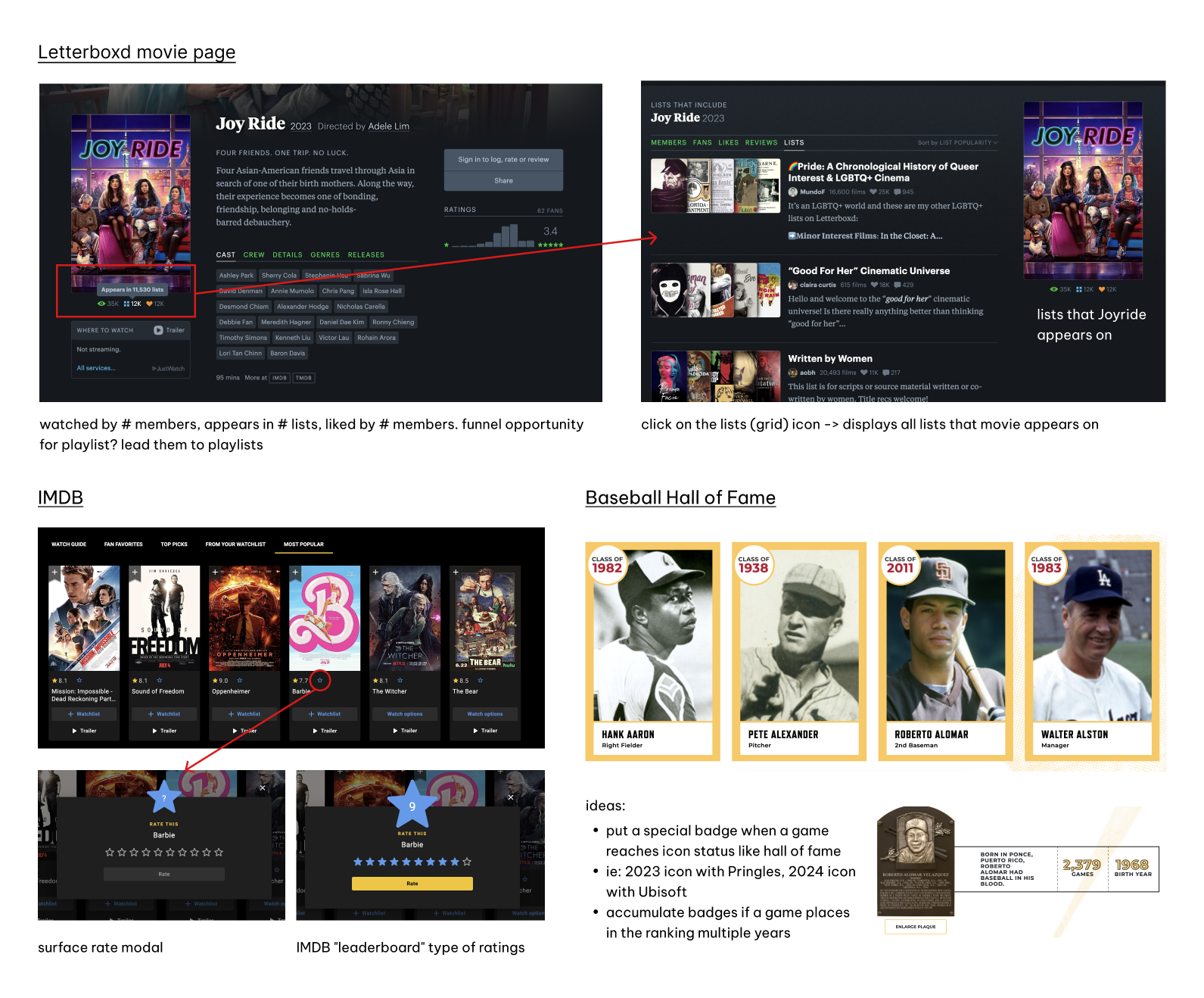
I examined Letterboxd and IMDB to understand how they aggregate user reviews and ratings. IMDB provides quick rating options, while Letterboxd showcases user statistics on film pages. I also looked at the Baseball Hall of Fame, which provides "awards" or "honorary badges" to its inducted recipients. These ideas inspired my thought process for design.

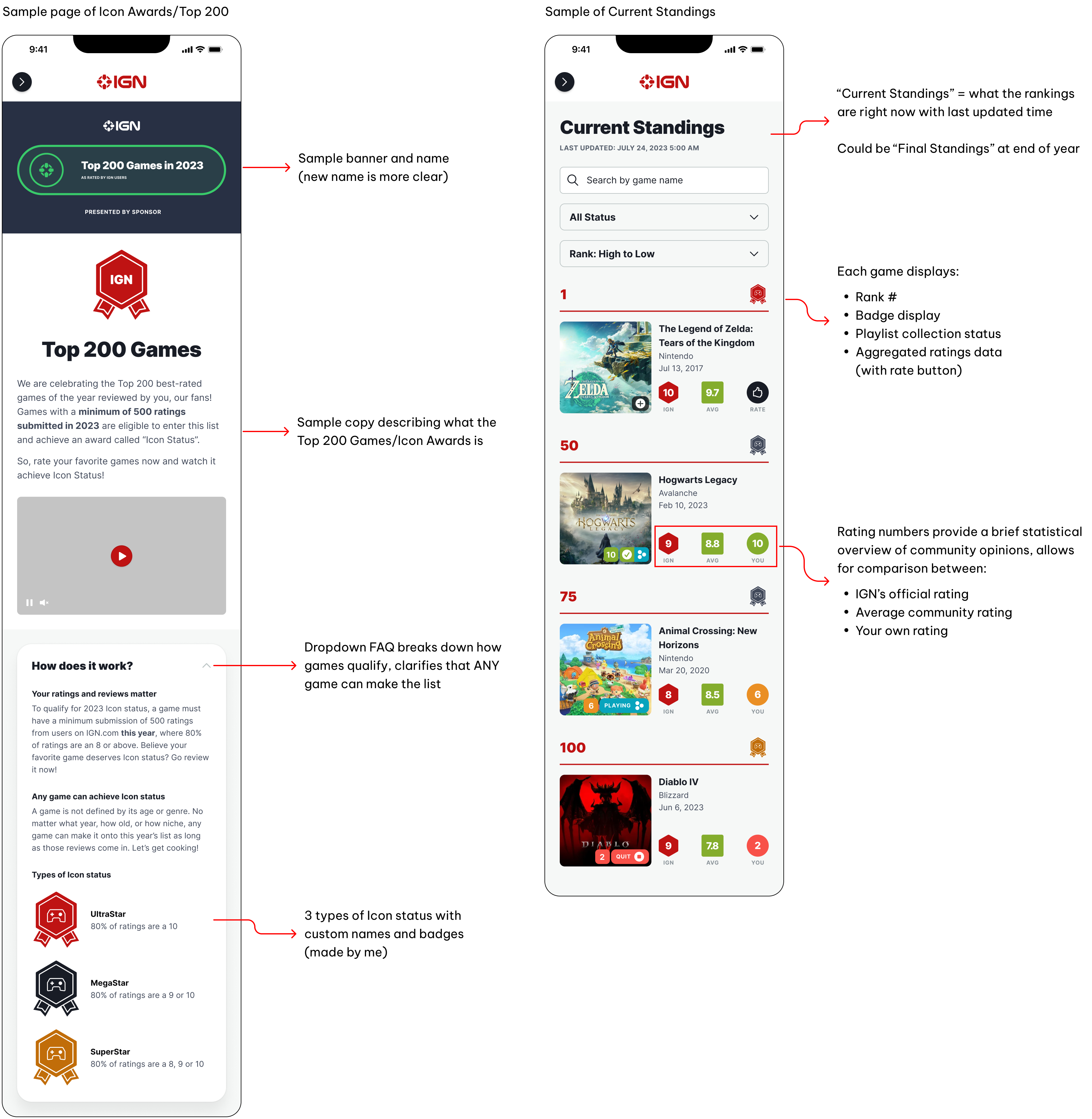
Examples of the Icon Awards/Top 200
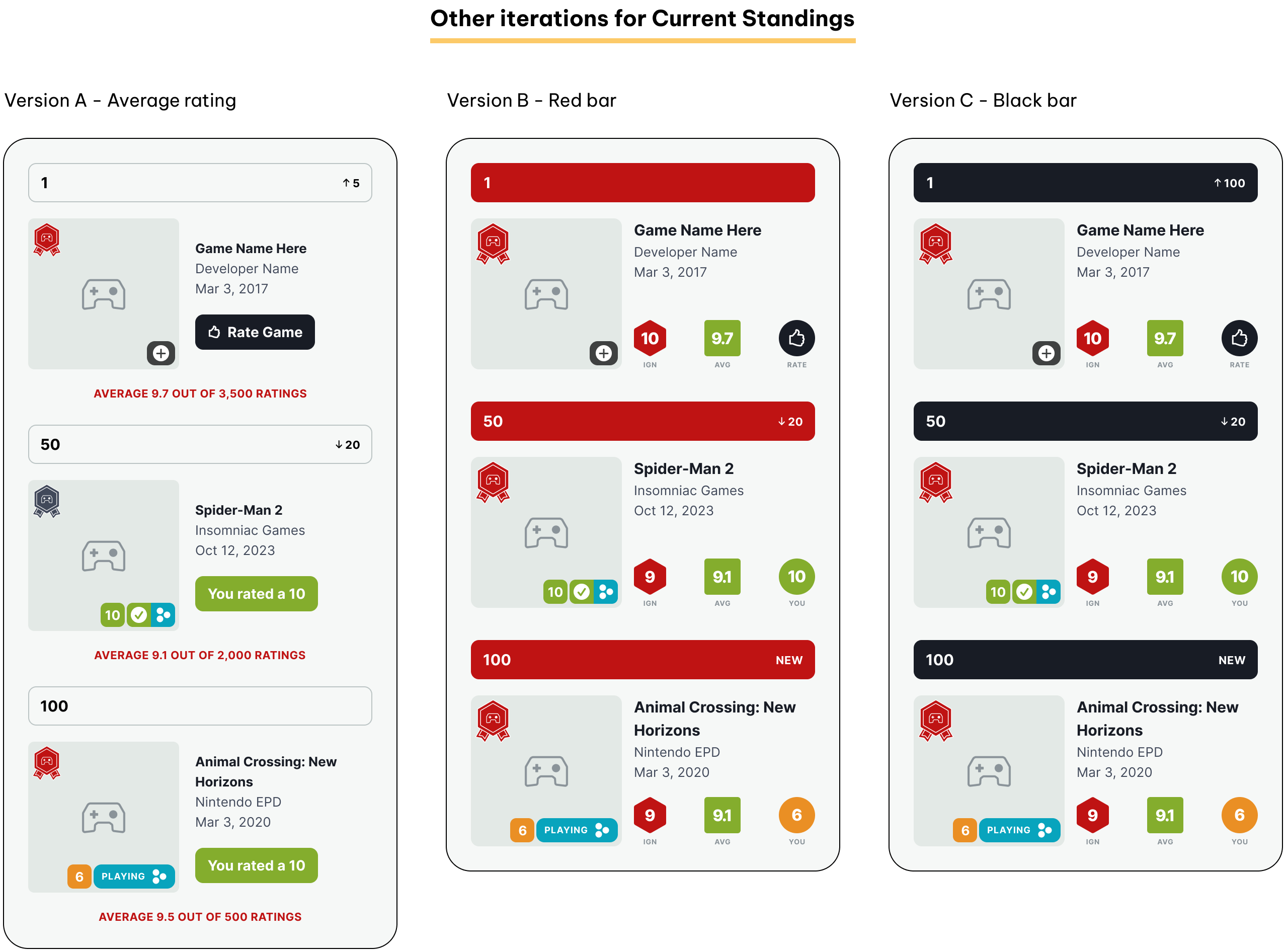
I created sample copy for the Icon Awards (aka the Top 200, if the name is changed in the future), explaining its purpose and how it works, while maintaining a friendly tone suitable for IGN's audience. For the Current Standings, I used numbers to create a more competitive leaderboard to motivate users to review their favorite games, empowering them to change its ranking or average rating.


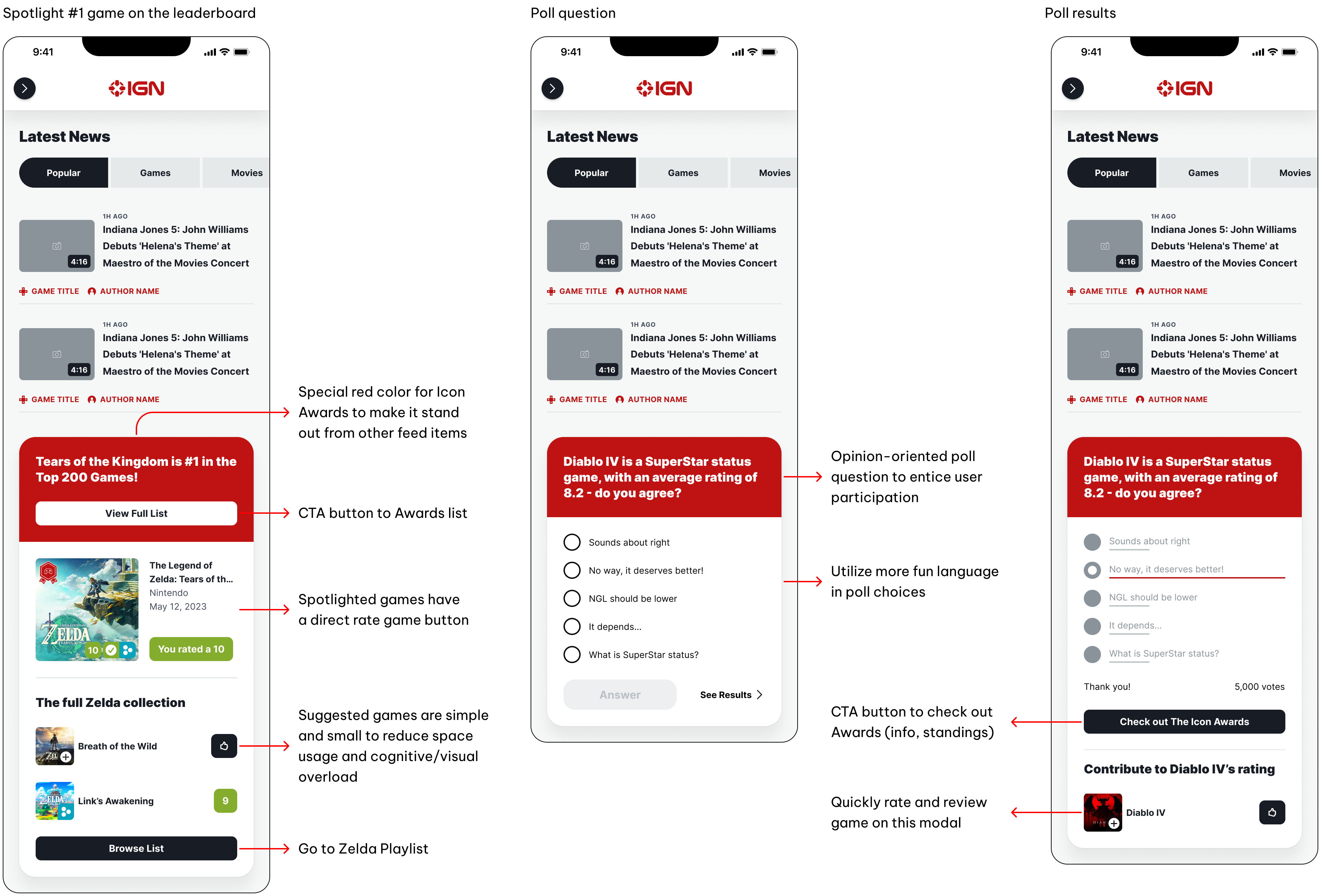
Examples of the Home Feed
These inline modals act as both an advertisement and a direct funnel to The Icon Awards, and can be easily reused in other areas of the website. Since the primary goal is to garner more ratings from users, I added buttons to quickly rate a game without navigating to the game's page like it currently does.

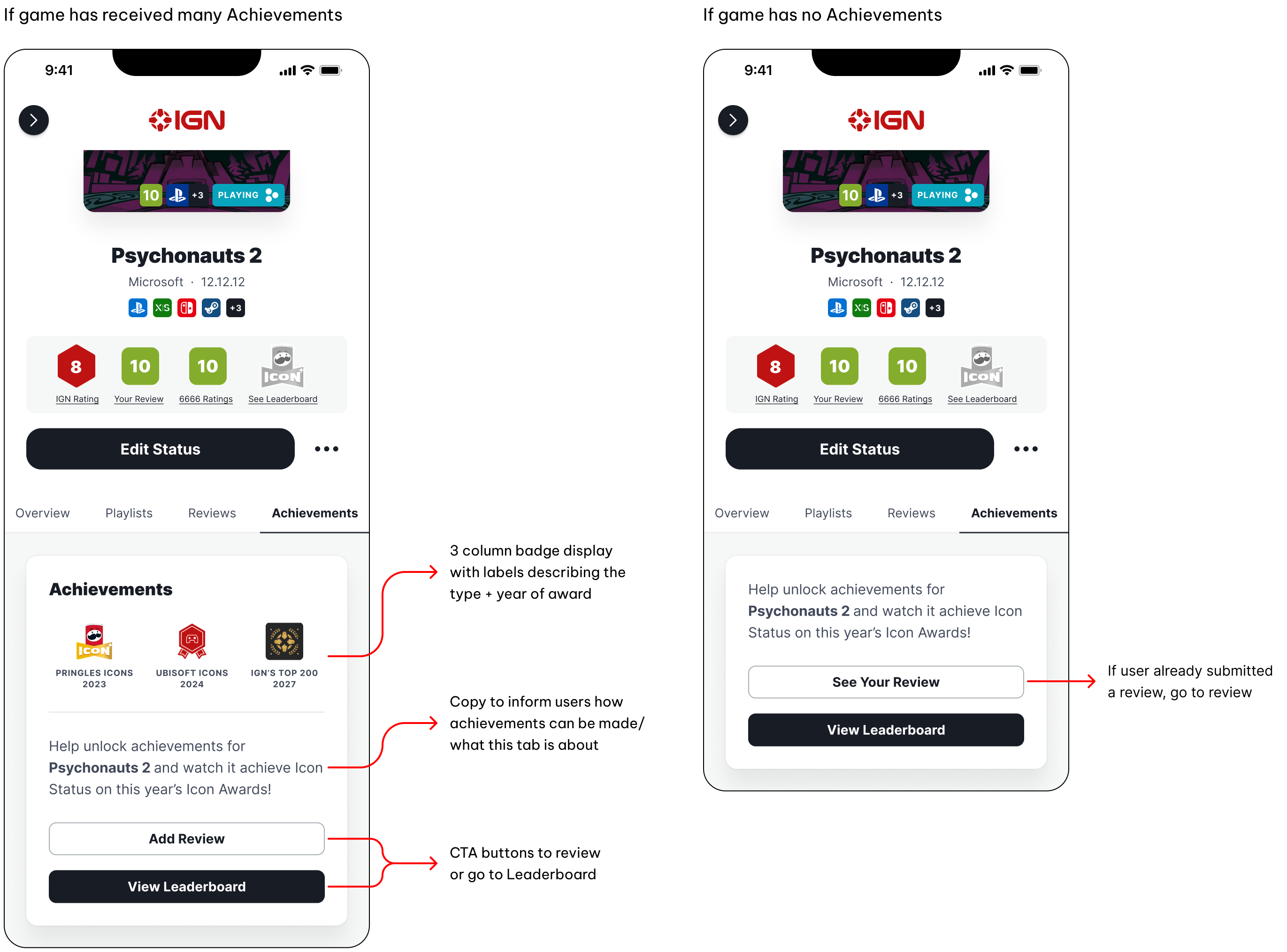
Examples of Achievements
I thought about how games can reappear on future lists, and came up with an Achievements section on the individual game page displaying all the badges a game has collected so far.

Reflection
I joined IGN during their transition into a stronger Product team, giving me insight into the project management cycle and what UX team maturity looks like. One of my projects was cancelled, which was quite a humbling experience. Priorities shift and projects get backlogged, so it's important to stay flexible!
I also conducted usability testing to compare my Calendar redesign with the old version. Although we did it backwards (should be discovery first), the redesign significantly improved navigation speed and ease.
I'm very fortunate to have met such a supportive and friendly team at IGN, who allowed me to spearhead the conceptualization for the future Icon Awards. I cherish this project like it's my child, and I hope to see it launched one day!
Lastly, I learned a lot about myself. While I may be a competent designer, I still have room to grow socially! Since the internship, I've been actively improving on my social skills by speaking up more and sharing my thoughts with others, embracing who I am and the value I can bring to a Product/UX team.
