Café X

I participated in a UCSD program called Design Co: Power Up, which teamed up students with small businesses in San Diego. My team worked with Café X: By Any Beans Necessary, where I redesigned, integrated, and relaunched their e-commerce website.

  • Role
    UX/UI Design, Research & Testing, Web Development
  • Team
    Fiona F., Francesco M., Shad R., Nathen S., Camille Y.
  • Tools
    Figma, Google Drive
  • Timeline
    4 months (June to Oct 2021)
  • Cafe X Home Cafe X Store

    Getting to know Café X

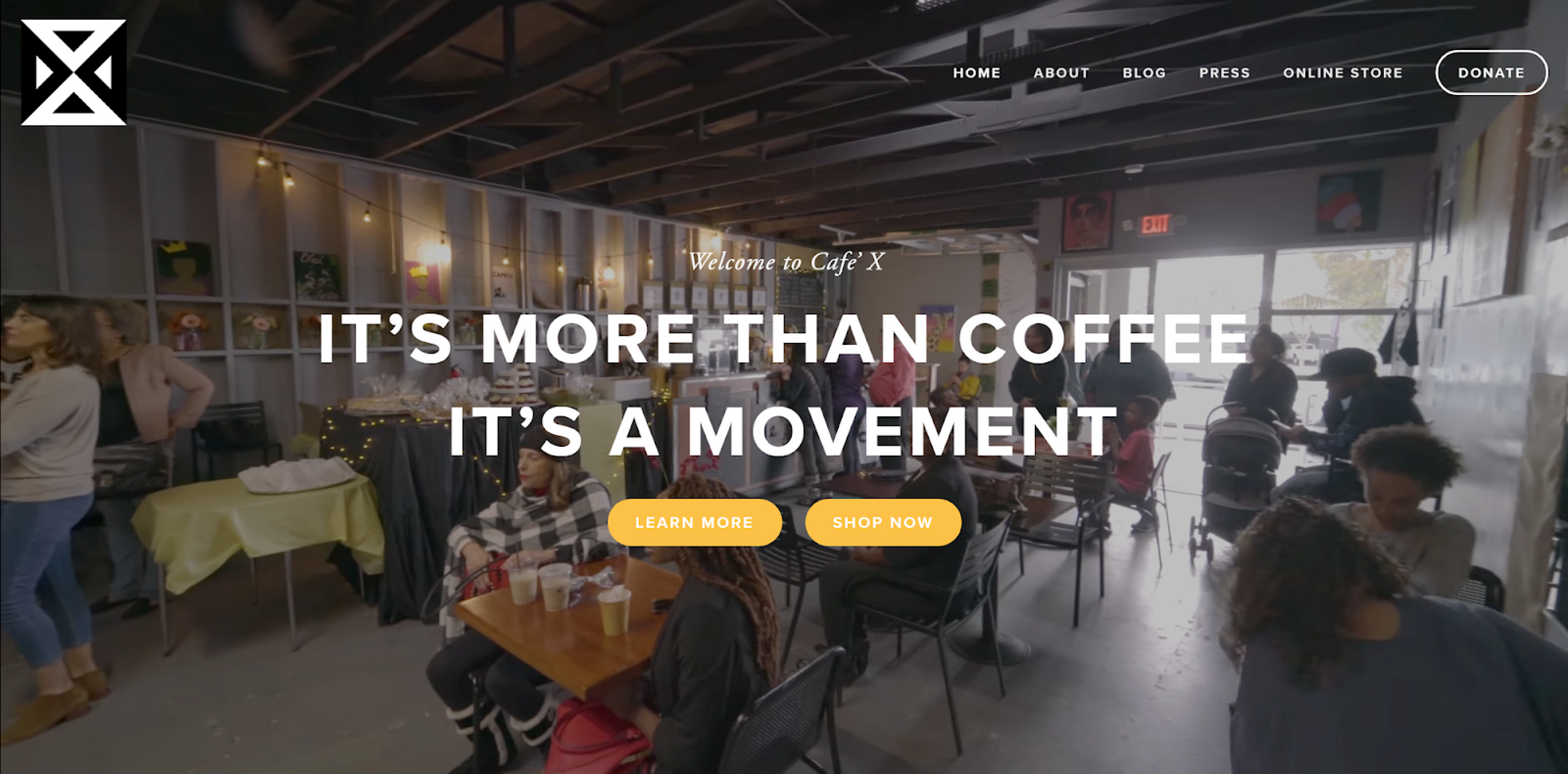
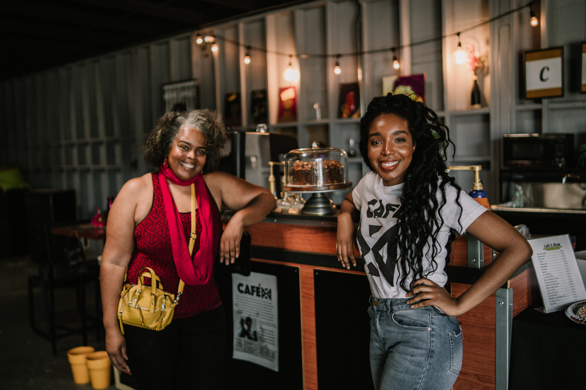
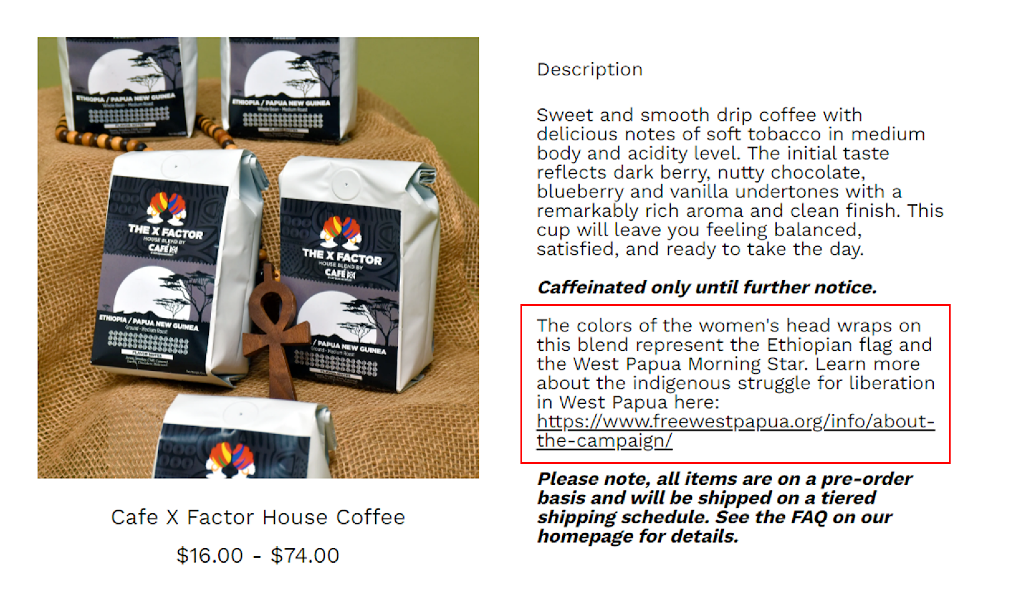
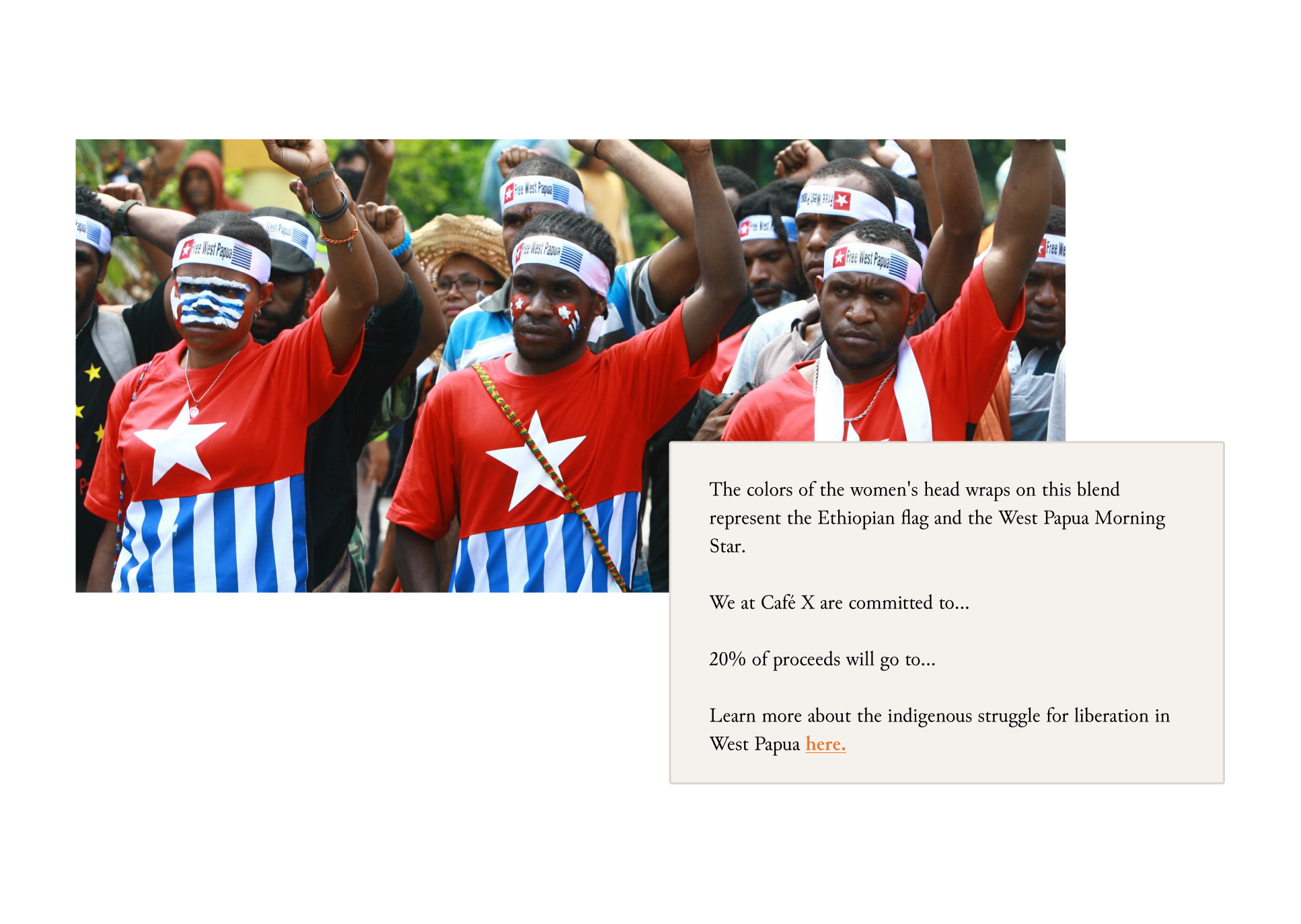
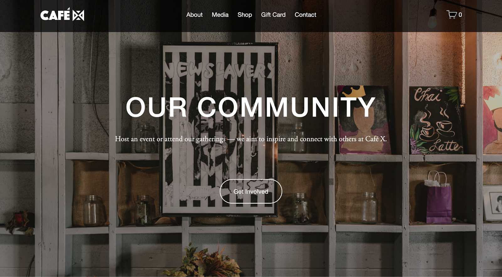
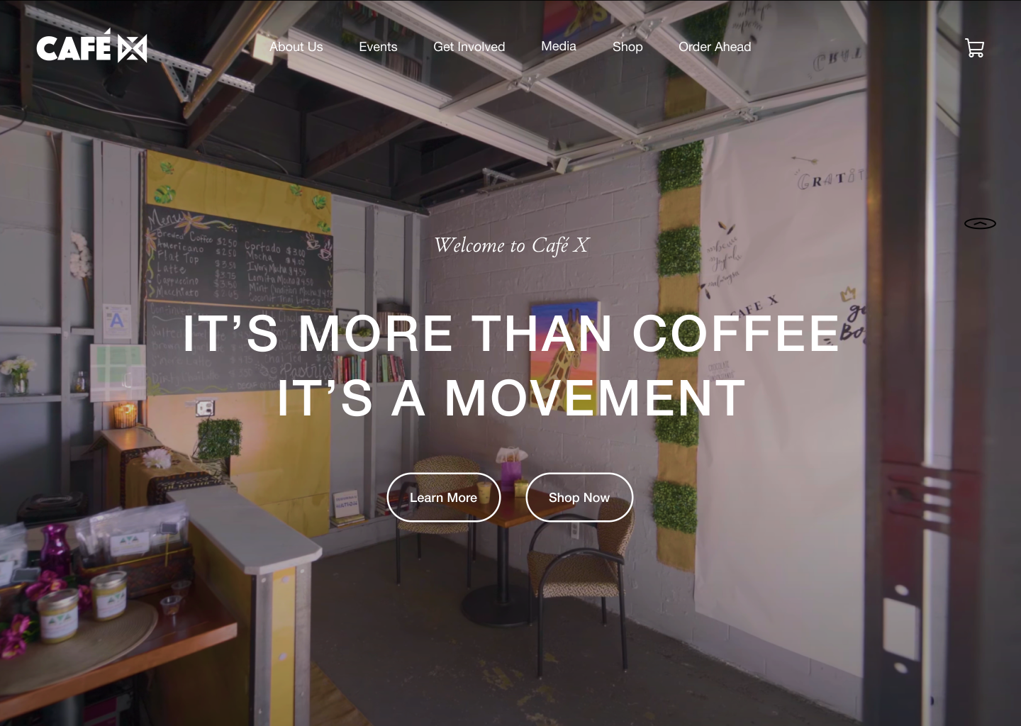
    During our first stakeholder meeting, we asked about their background, mission, and identity as a business. Café X is a family-owned, Black woman-owned co-operative coffee shop built to support generational wealth in the Black community and other marginalized communities, with a mission to empower, revive, and build connections through their community space. As the UX Designer for the website, my job was to enhance and support their vision.

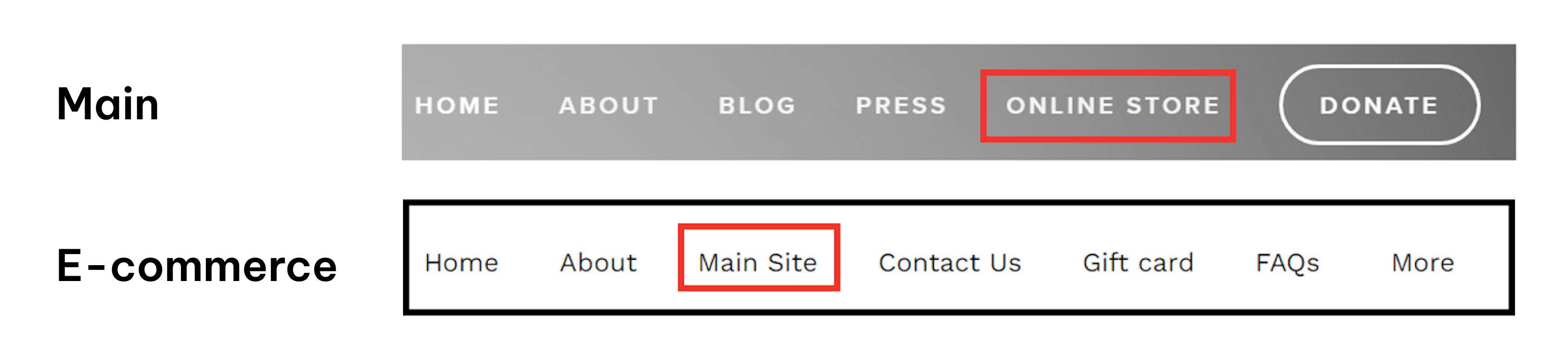
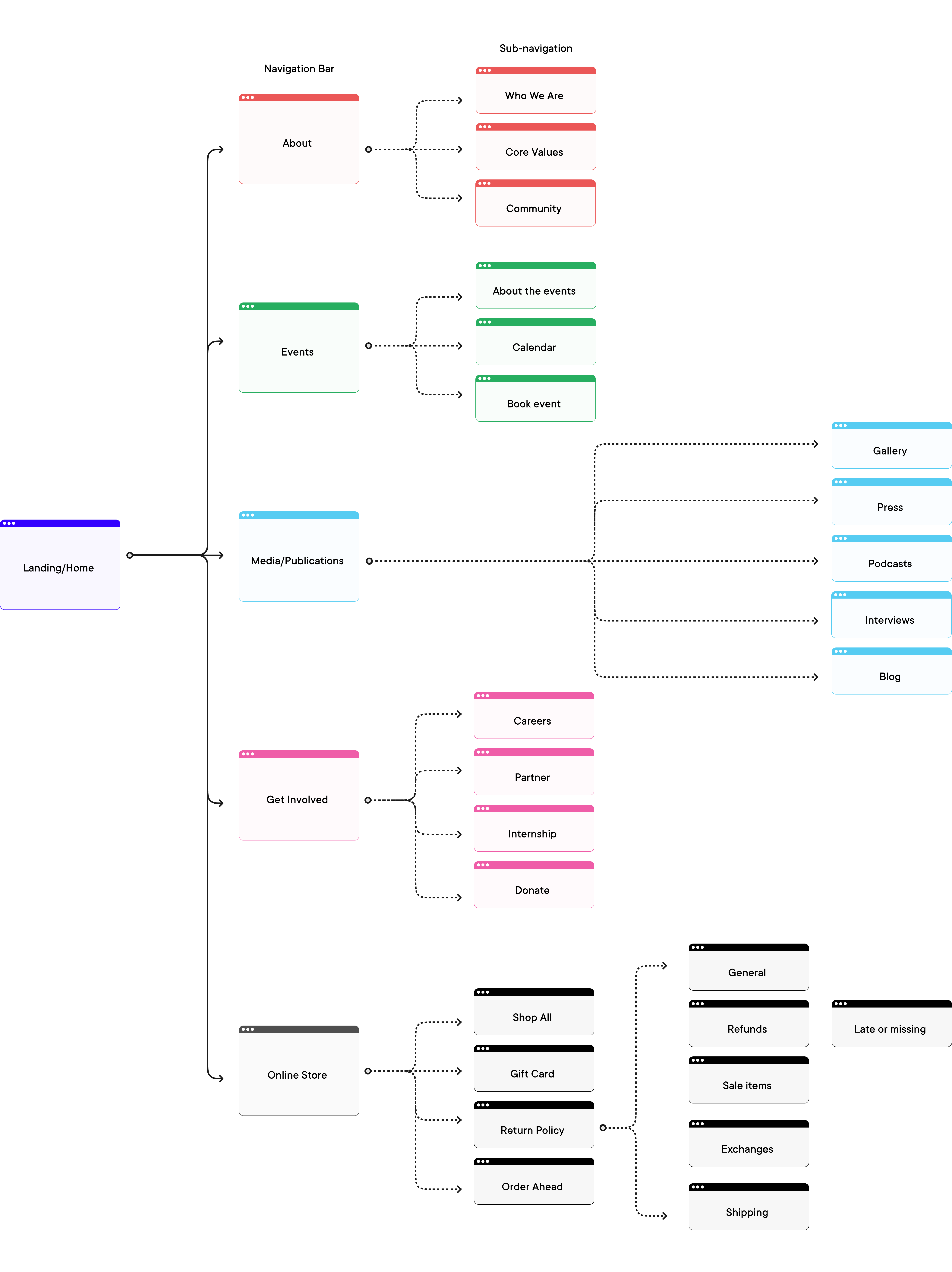
    Team's final deliverables

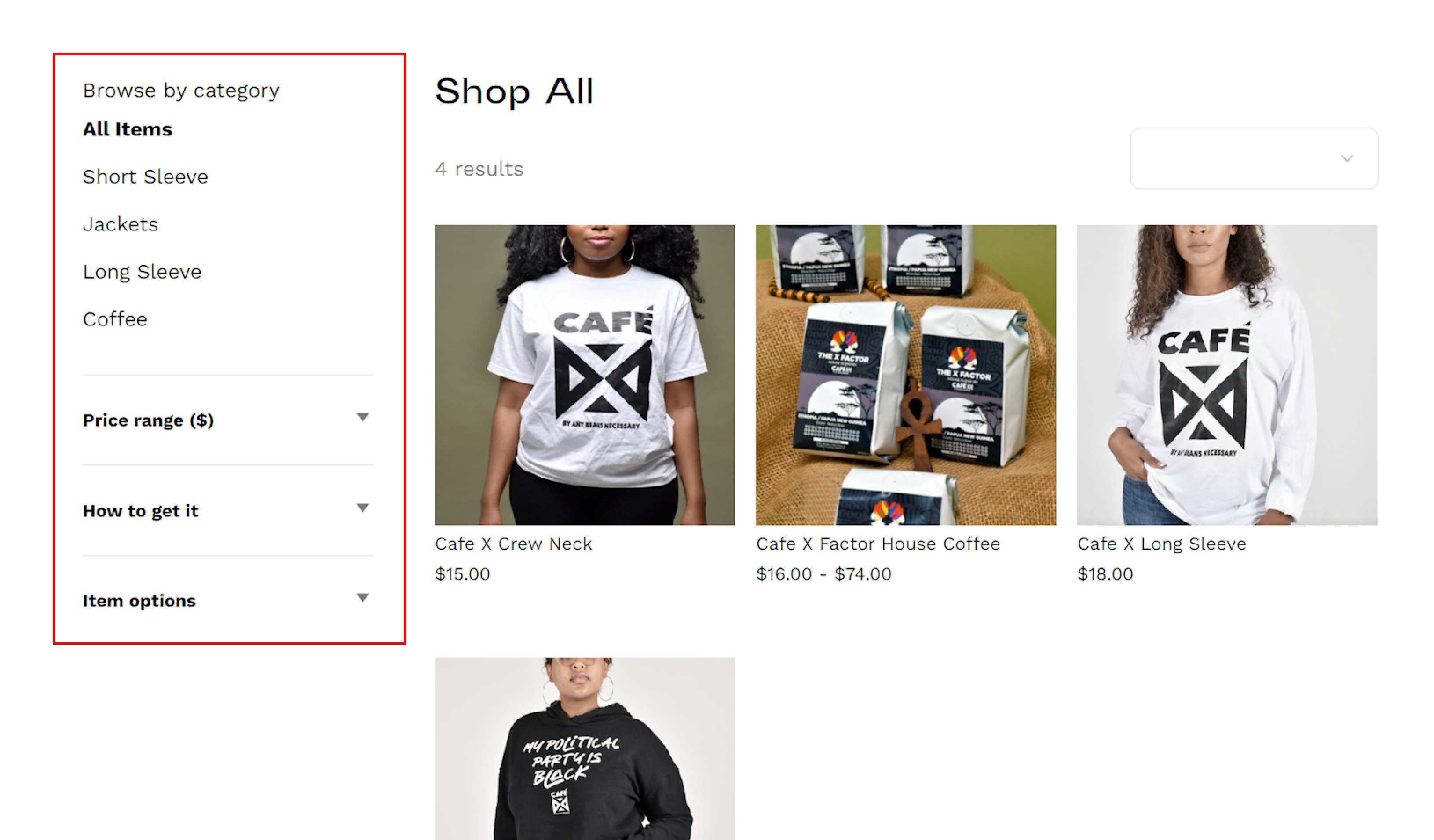
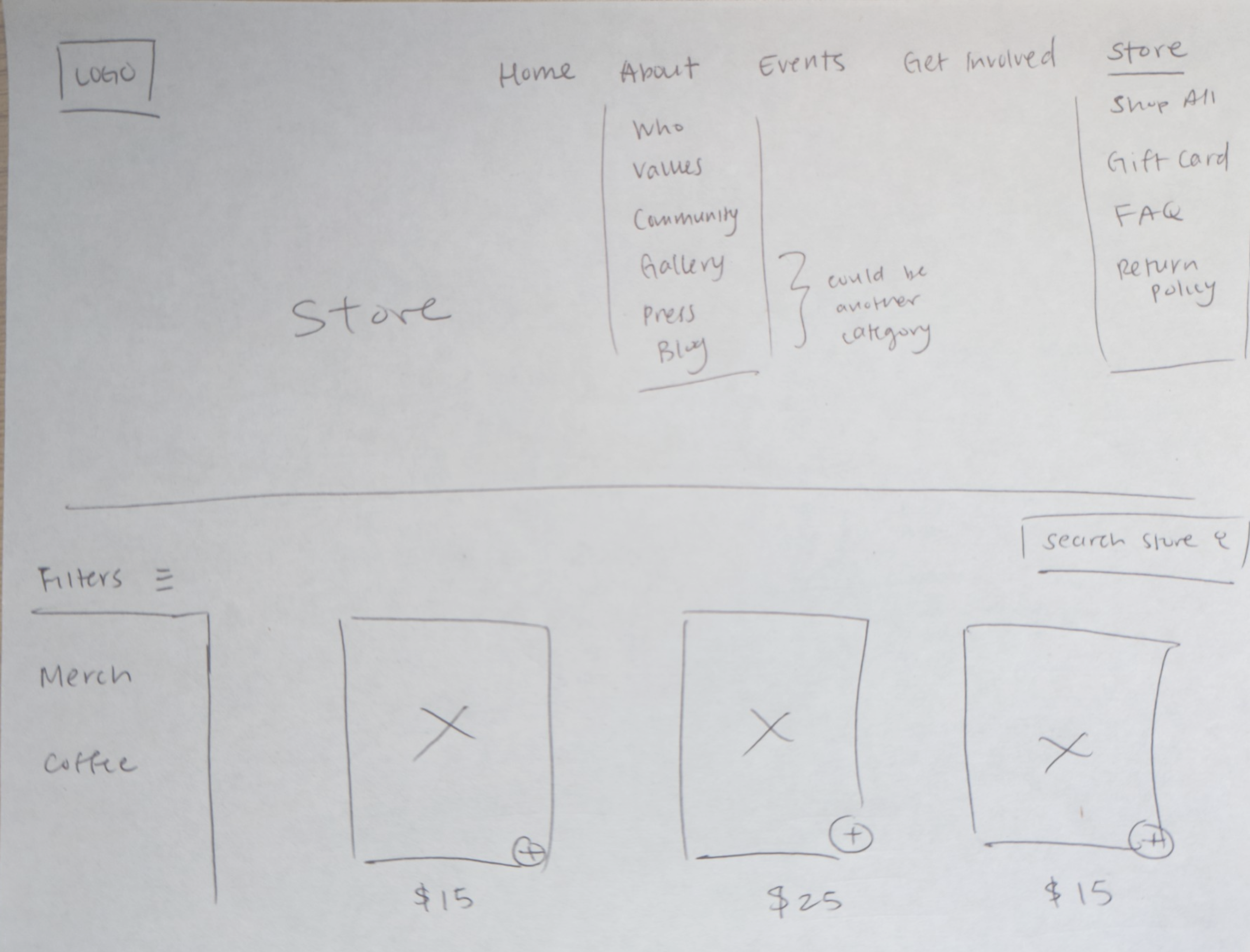
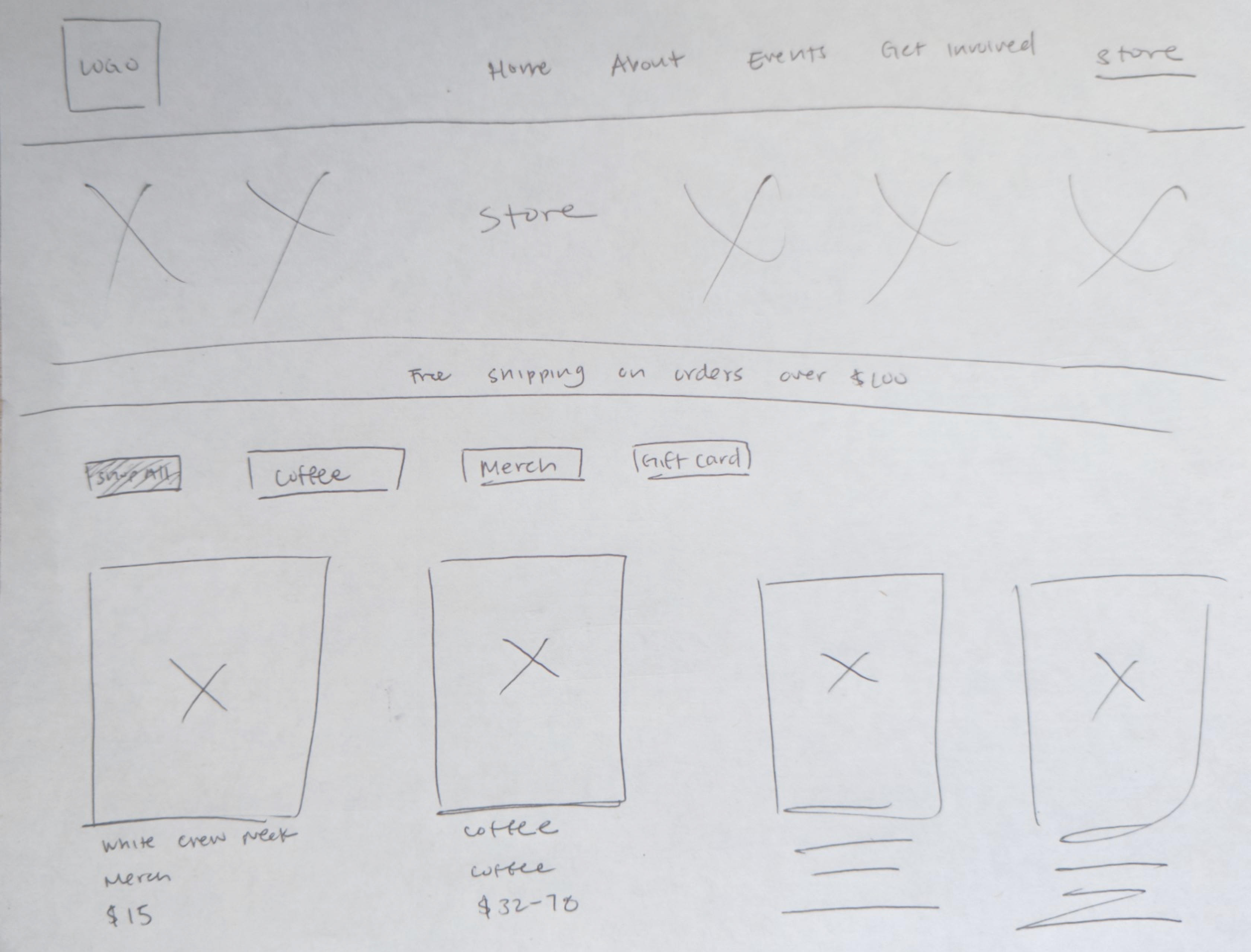
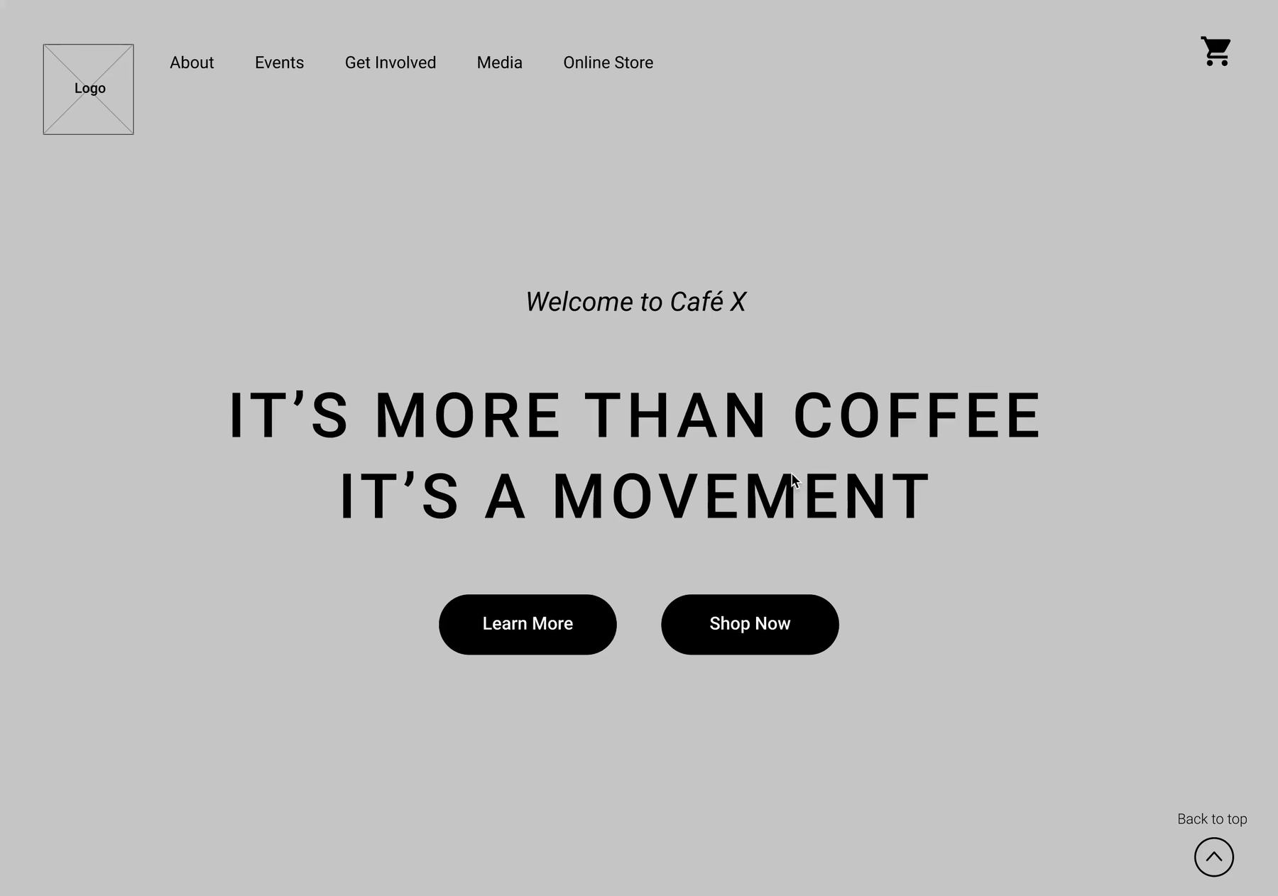
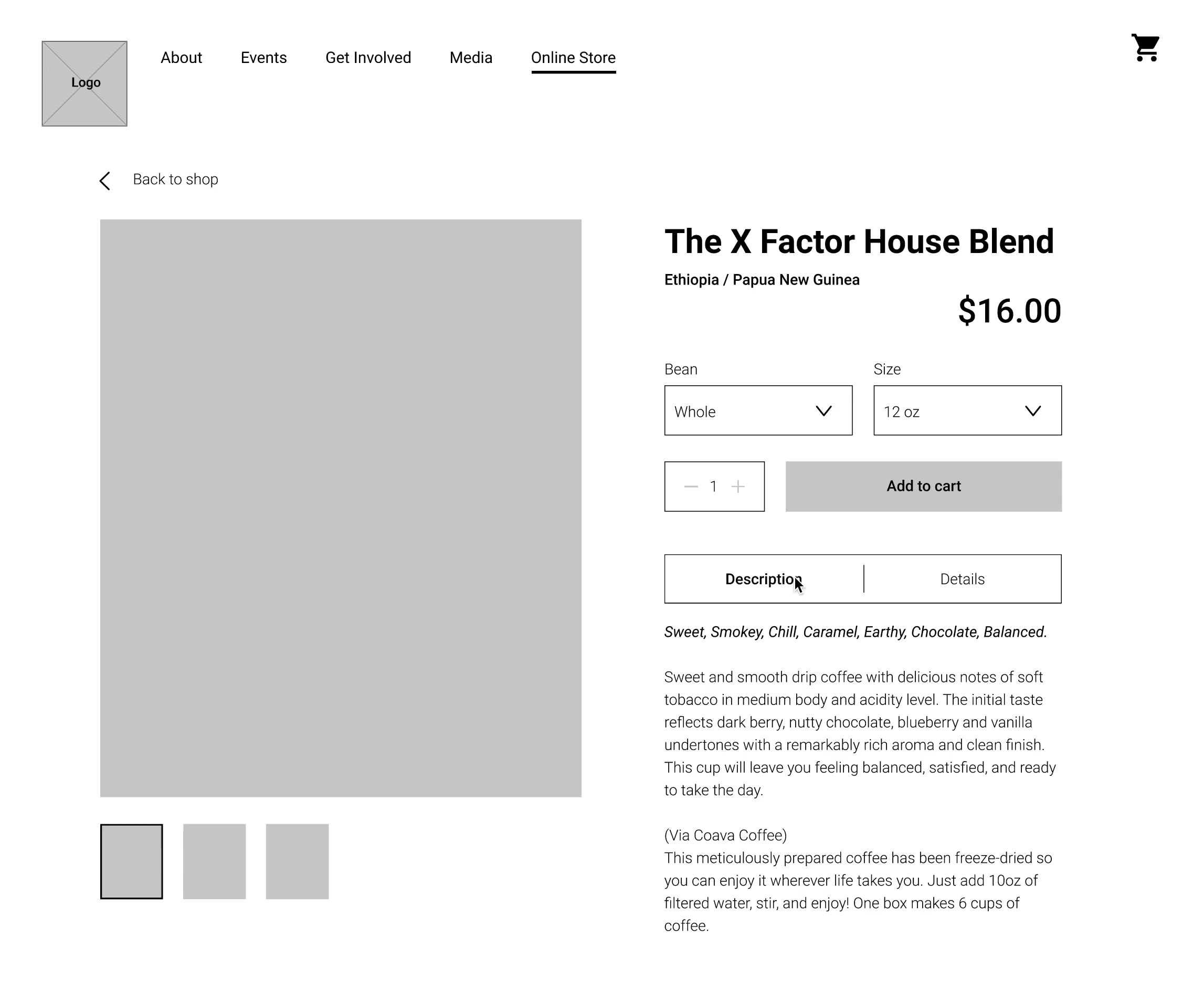
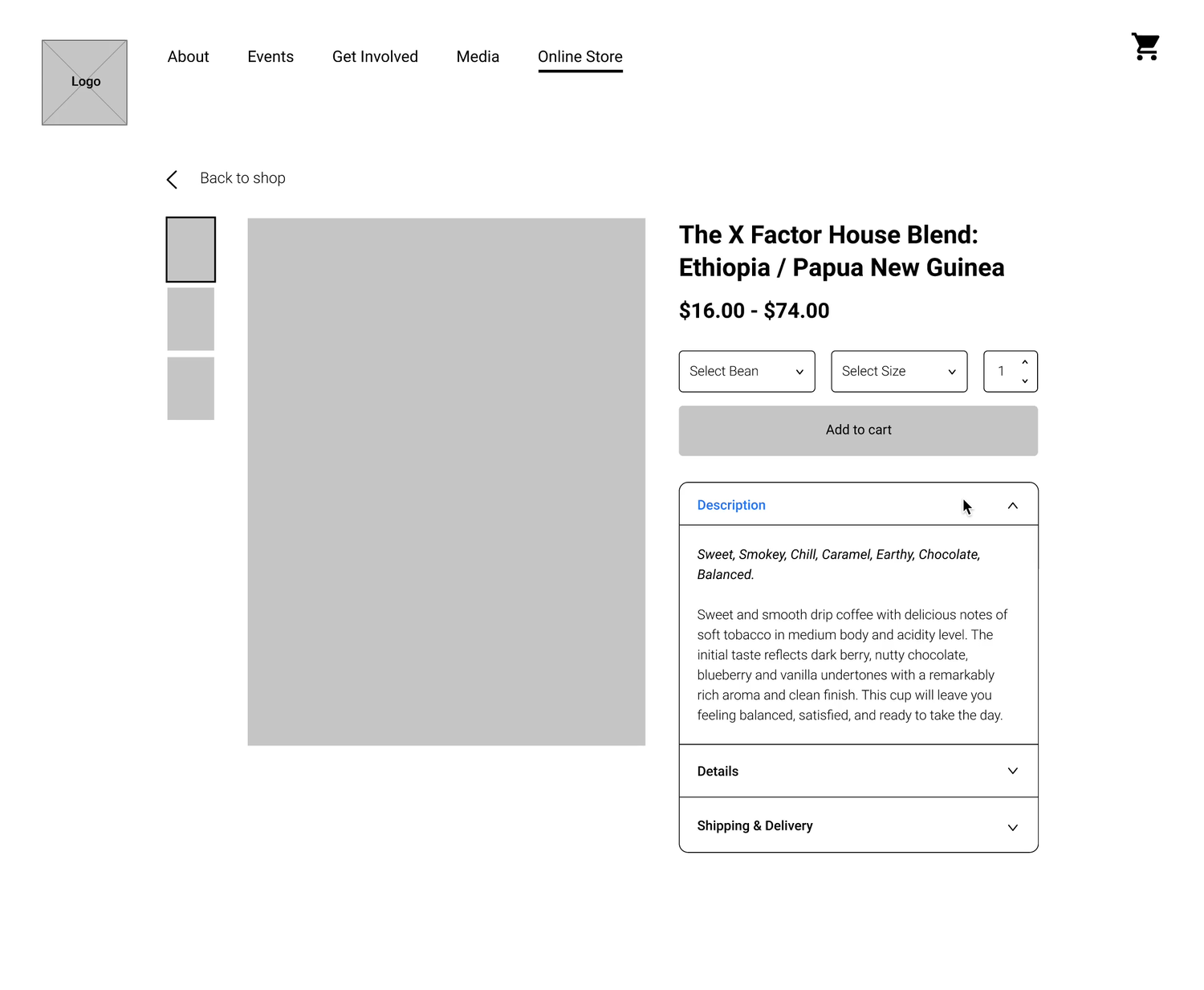
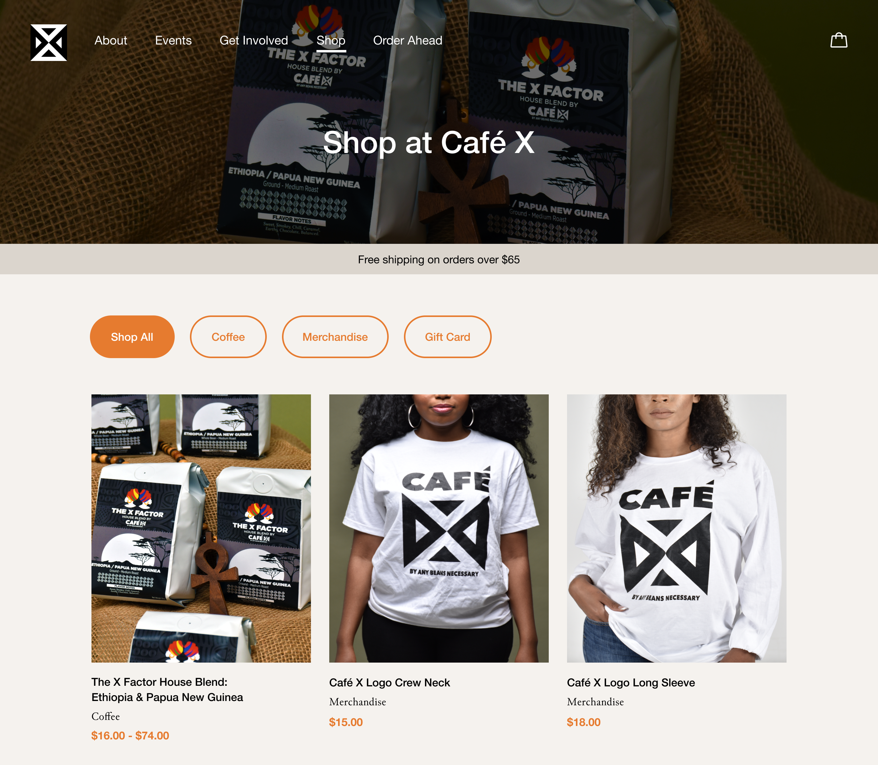
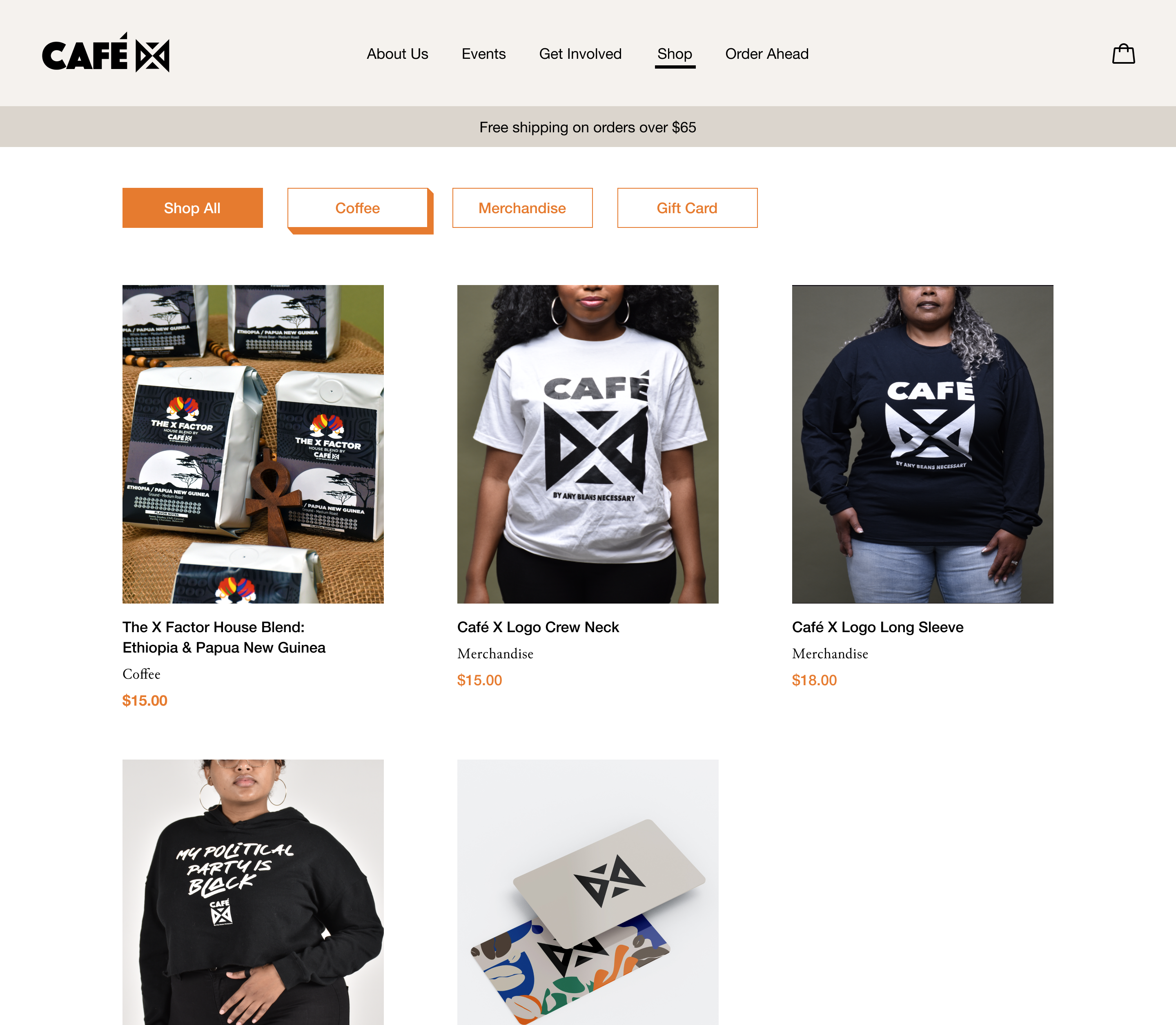
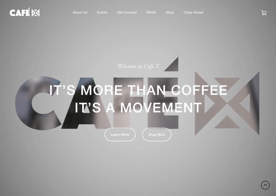
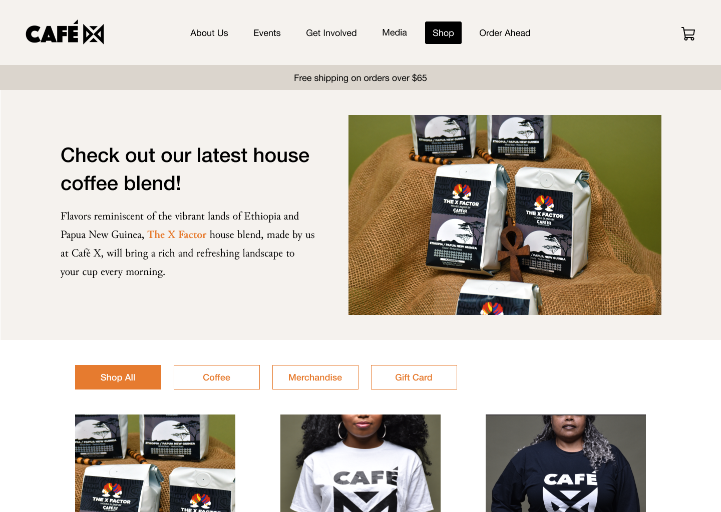
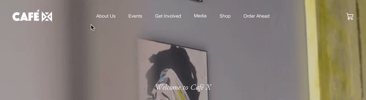
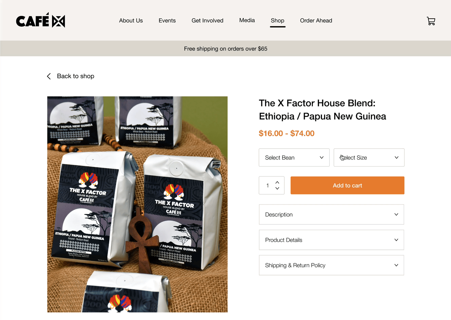
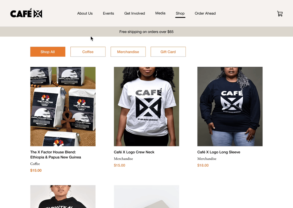
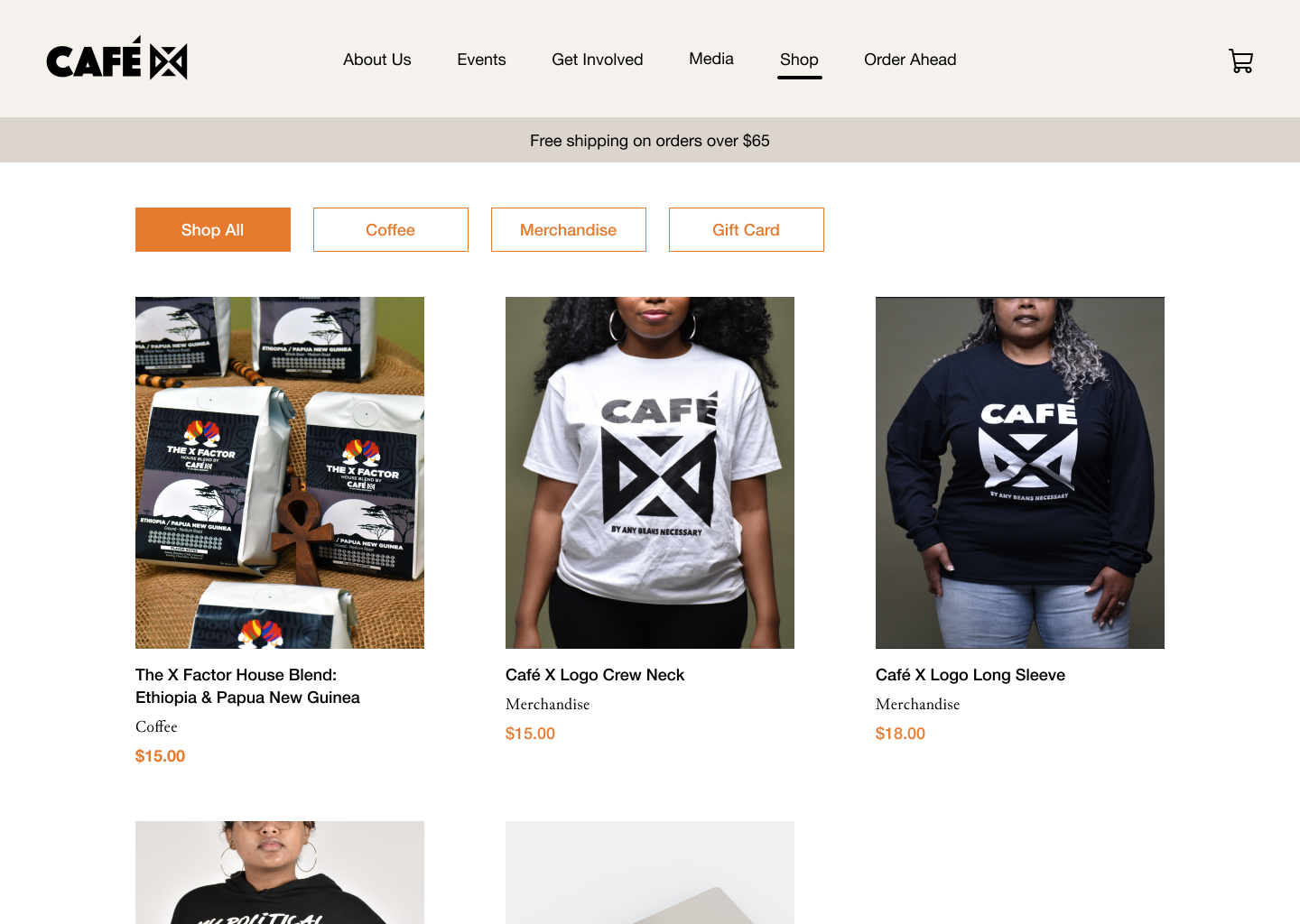
    1. Integrate their current blog and e-commerce websites into a single online experience on Squarespace (my deliverable).
    2. Launch a marketing campaign to promote their new store location and strengthen their online social media presence.

    Usability testing of current websites

    I examined both websites to understand the user experience and identify areas that could be improved on to better exemplify their brand. We conducted usability testing on 4 participants, who were all first-time visitors of the website and did not know anything about the business before.

    Original Cafe X website

    First impressions of Café X

    Participant M:
    “An inclusive space for Black folks in San Diego… they sell more than coffee and does more than coffee. It's a community movement.”

    Takeaway:
    First-time visitors immediately get a clear feel and understanding of who Café X is as a business and what kind of values they hold.

    Interior of Cafe X's store, showcasing a display of art such as a black and white striped poster resembling a prison cell, with text above that says New Slavery Cafe X owners, Cynthia and Khea, standing at the counter inside their store

    However, there were areas that needed improvement.

    Original websites' navigation bar
    Navigation Bar
    Users preferred navigating through a single website, instead of between websites.
    Original website's online shop
    Online Shop
    Categories are too specific and filters are irrelevant for a small inventory, creating unnecessary clutter.
    Original website's product listing
    Product Listing
    Visual hierarchy prioritizes bold text, drawing attention away from important information Café X wants to highlight.

    Competitive Analysis

    I compared Café X with other food and beverage businesses to find ideas to implement for the new website design, such as increasing transparency of the production process, and getting involved with their business or their mission's movement.

    Competitive Analysis

    Initial UX Flow

    UX Flow

    Website integration sketches

    I reorganized the information architecture to integrate the online store and introduce new features to exemplify Café X's community aspect. Below are different sketches of the new navigation bar and Store page.

    Sketch 1 Sketch 2

    Lo-Fi Prototyping + Testing (5 participants)

    During our testing, participants had similar responses towards what each of the navigation labels represented, thus validating the label names and its expected content.

    I simplified the shop filters by making overarching categories, such as “Coffee” and “Merchandise”, to reduce visual clutter and cognitive overload.

    Lofi Store gif

    For the Product Listing page, I broke down the product information to optimize discoverability and organization. All 5 participants preferred Version B, as it was more noticeable and organized.

    Lofi Product Listing: Toggle Version
    Version A: Toggle Switch
    Lofi Product Listing: Accordion Version
    Version B: Accordion

    Hi-Fi Prototyping

    For the Store's landing page, I designed different versions by playing with the color scheme, button type, and navigation bar layout. As a team, we chose Version B for its usage of vibrant colors, simplicity, and cleanliness.

    Hi-Fi Store: Version A
    Version A: Banner, round filters
    Hi-Fi Store: Version B
    Version B: No banner, orange 3D filters

    To promote Café X's new coffee beans product, I tested 2 versions of the advertisement with 3 participants. They preferred Version A, since the pop-up captivated their attention more. However, they were also likely to immediately close and ignore pop-ups. Nevertheless, I proposed that using both ideas could increase advertisement and exposure.

    Hi-Fi Ad: Version A
    Version A: Home page pop-up
    Hi-Fi Store: Version B
    Version B: Store banner

    Other final mockup screens

    New navigation bar
    New navigation bar with dropdown menus
    New product information layout
    New color scheme and information layout for Coffee Beans' product listing page
    Special section highlighting liberation movement
    Special section to highlight product's inspiration and raises awareness for the liberation movement
    New store filters
    New and simplified Store filters

    Reflection

    Café X loved my website redesign and the team's user research and strategization. They wanted to use my redesign for their new official site!

    This was my first time working with a client, which made me grow a lot as a designer. I unexpectedly took over web development even though I had very minimal front-end knowledge at the time. Because of my limitations, I could not fully execute some of my design ideas, but it made me realize the big difference between designing for aesthetics and designing for long-lasting practicality (aka, client handoff and self-maintenance). Now, I am more mindful of design constraints and am more confident as both a designer and developer!