Collaborate on Procreate

Procreate is a popular iPad digital art application widely used by professional and recreational artists, yet it currently lacks streamlined collaboration features. We aimed to improve Procreate’s collaboration and communication process, making it more efficient to do collaborative tasks such as drawing simultaneously, sharing pieces, and making feedback-based edits.

  • Role
    UX/UI Design, Research & Testing, UX Writing
  • Team
    Rhiannon L., Elina S., Janet W.
  • Tools
    Figma, Google Drive
  • Timeline
    10 weeks (Jan to Mar 2022)
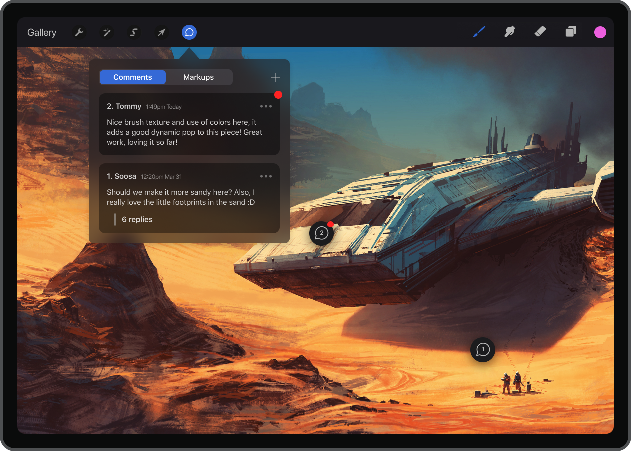
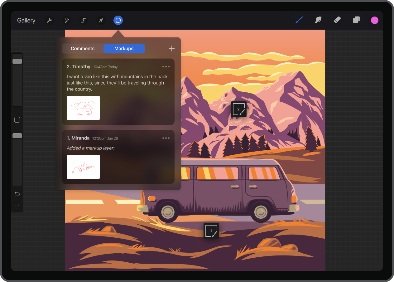
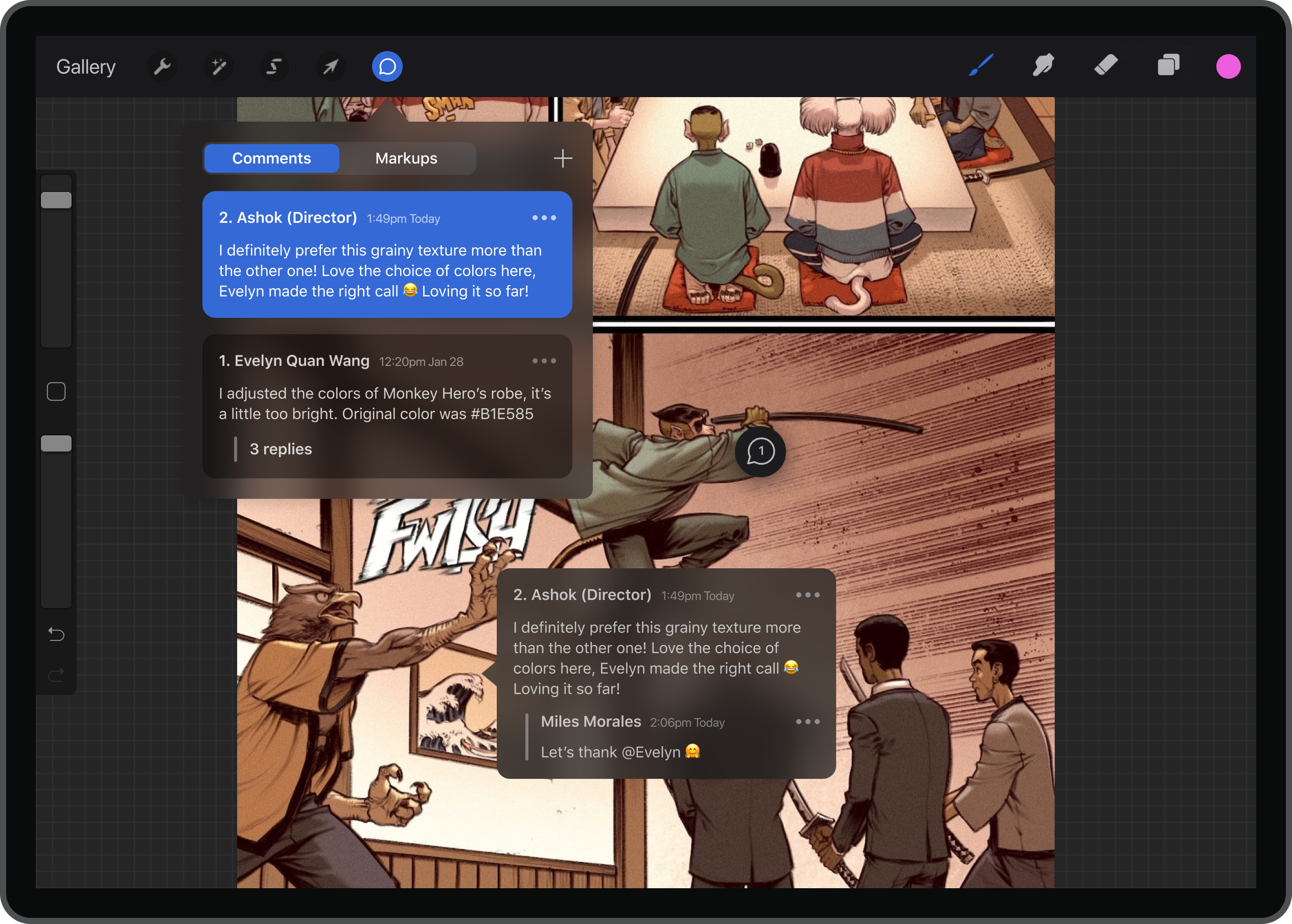
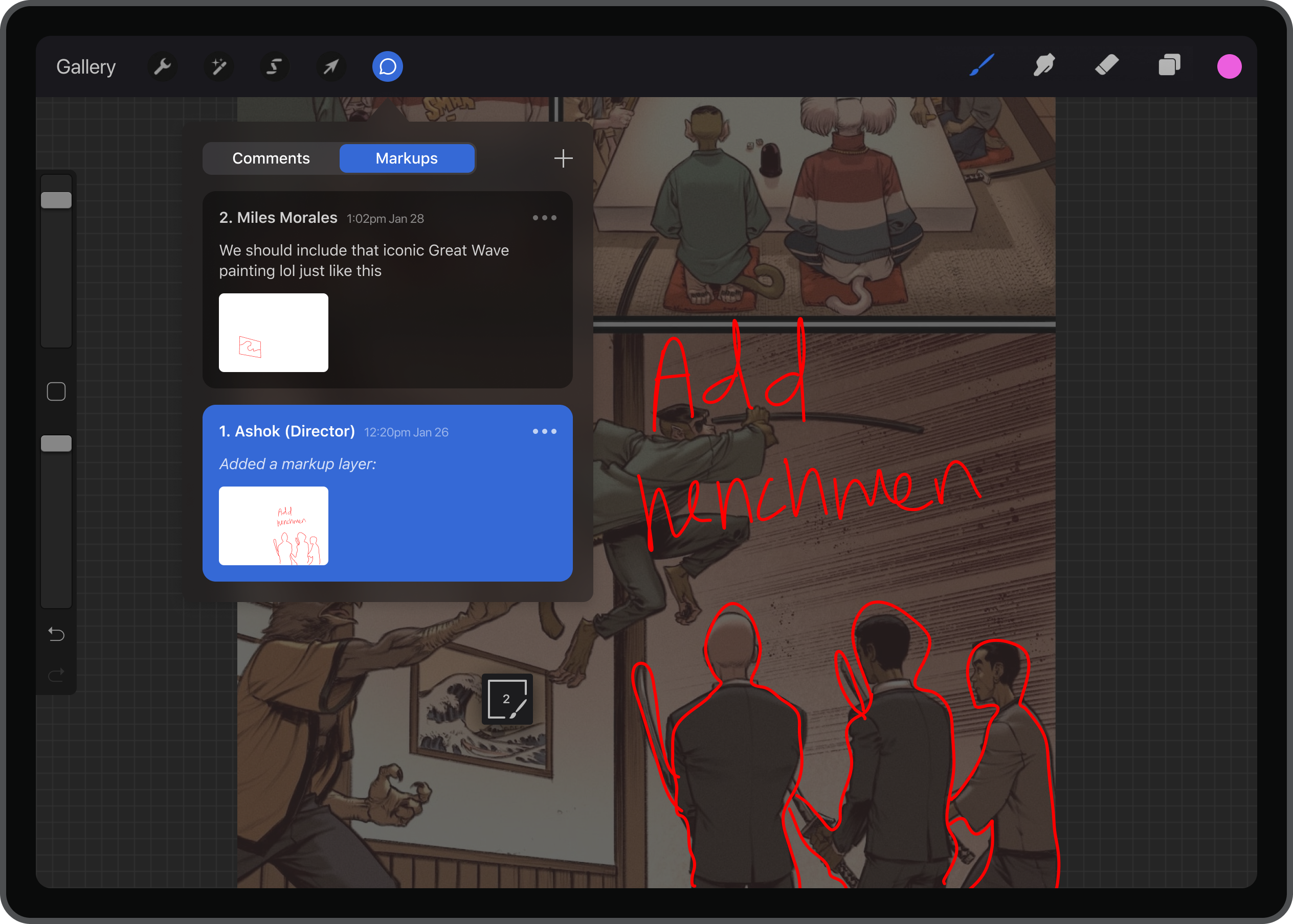
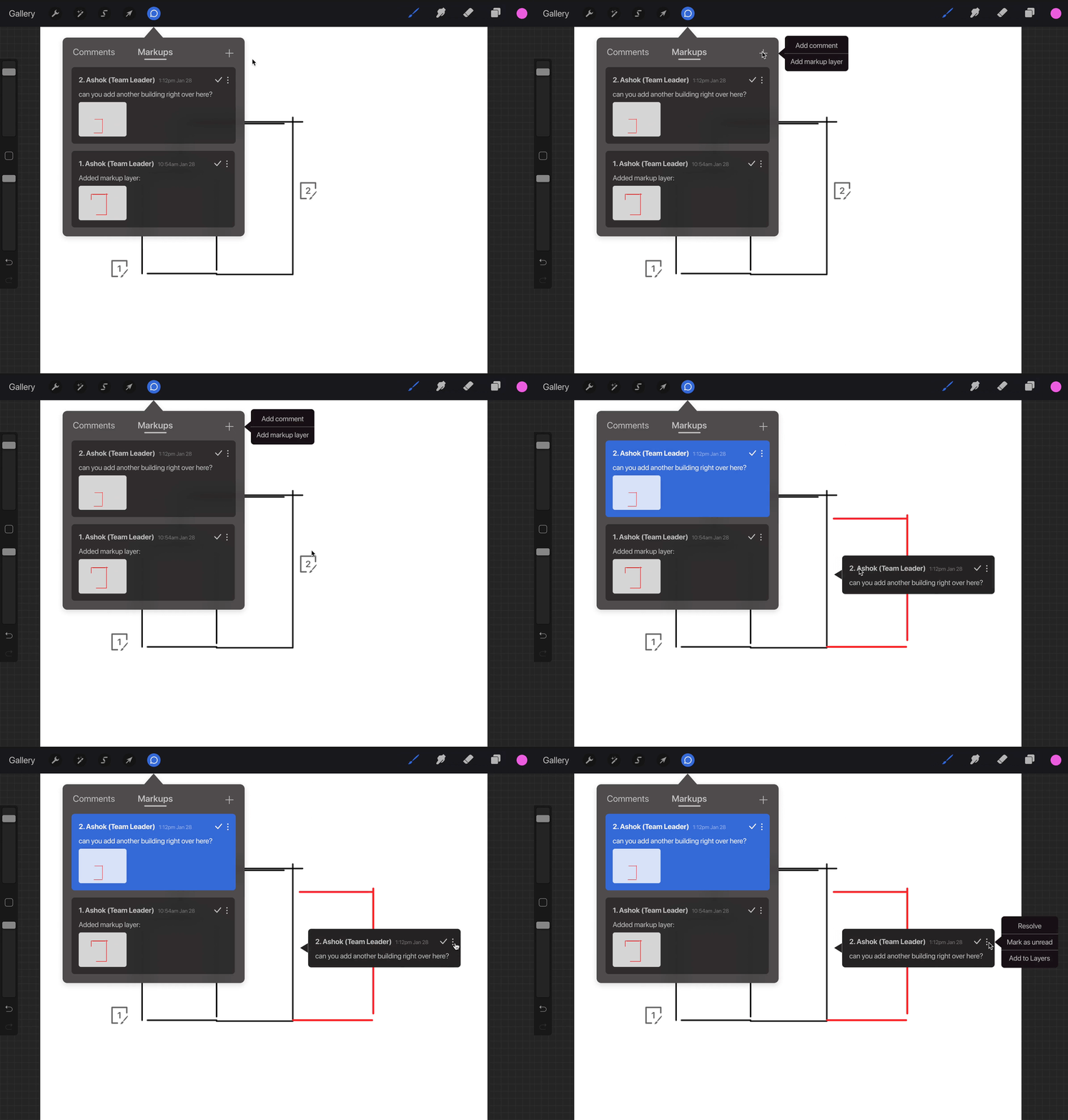
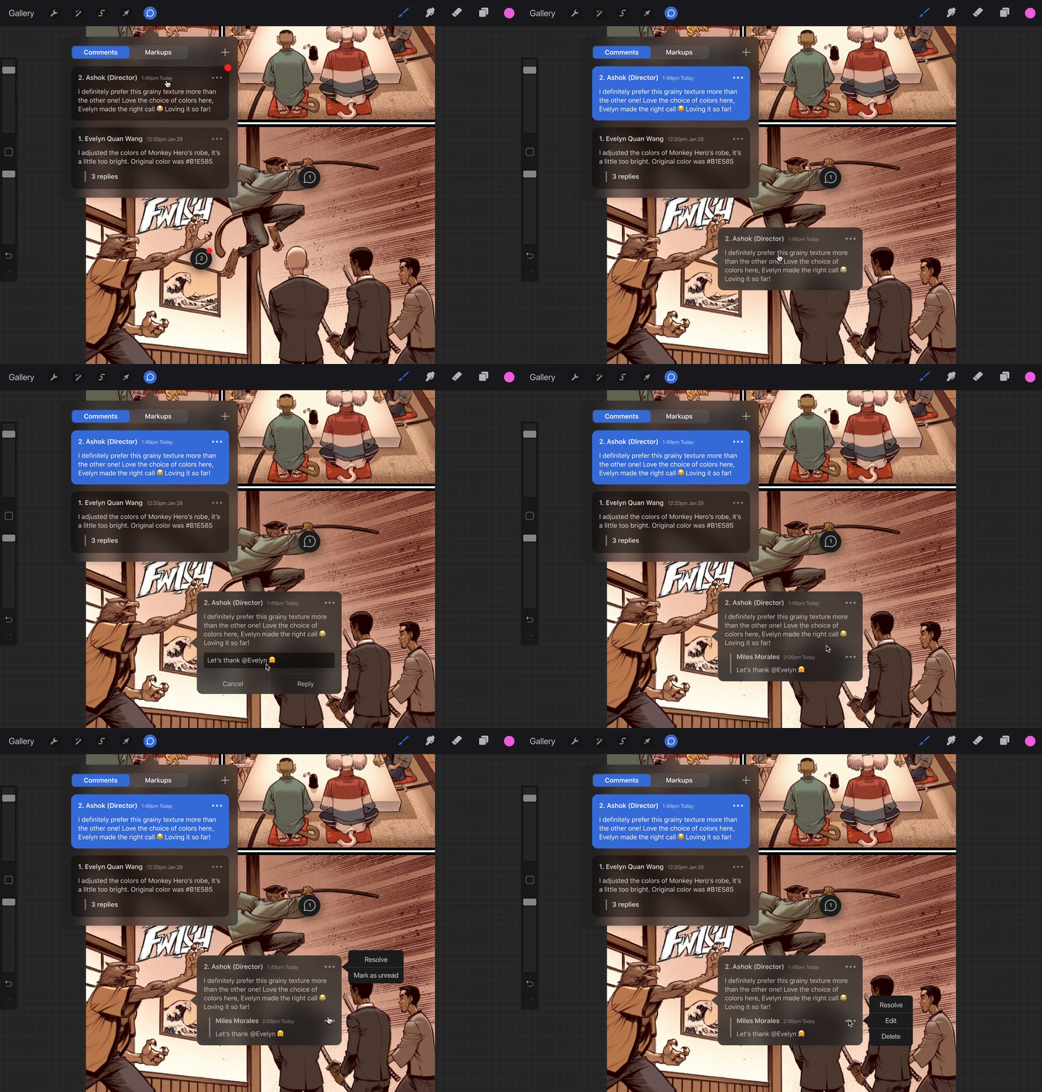
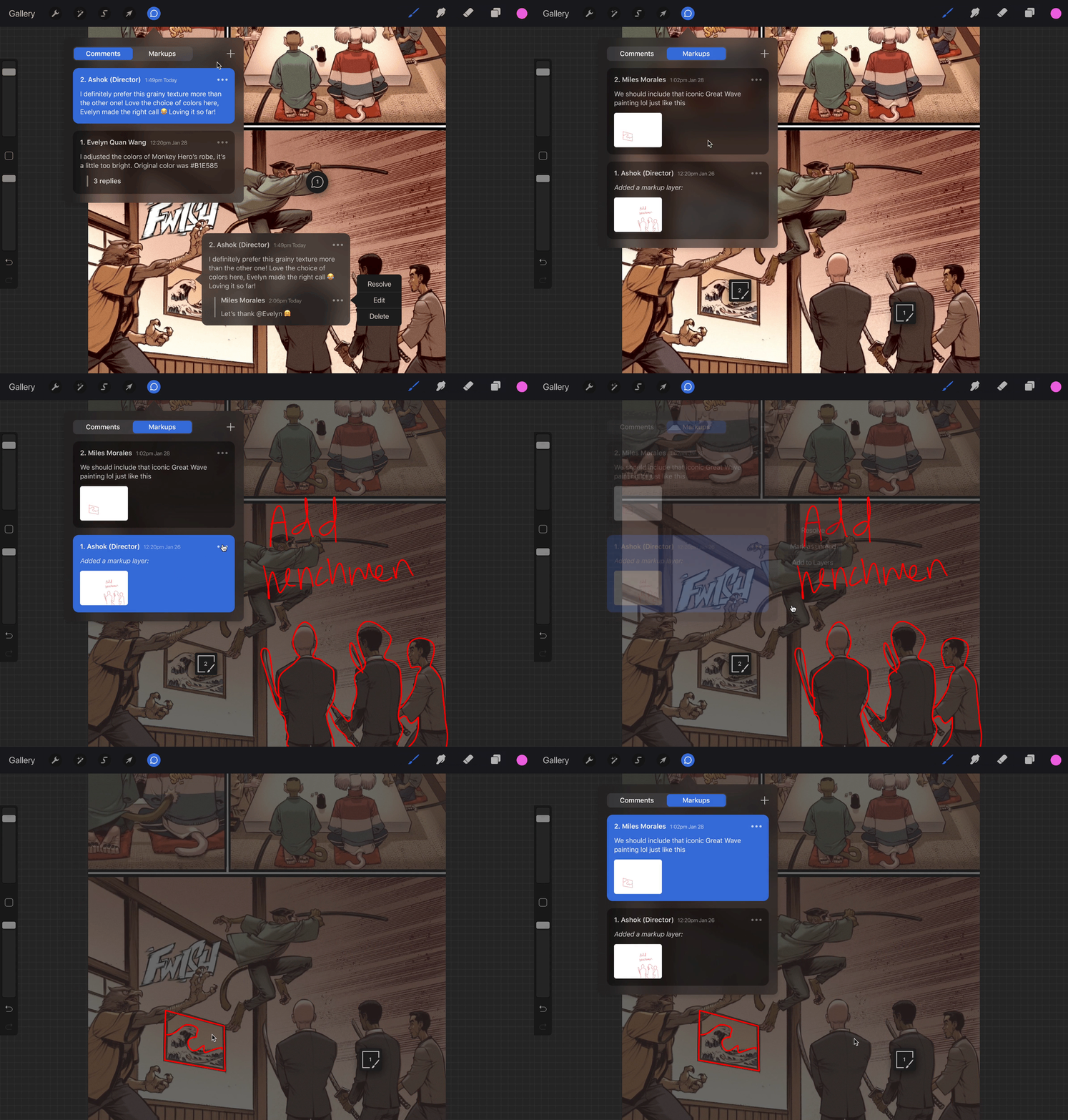
  • Procreate Splash - Comments example with spaceship Procreate Splash - Markups example with truck Procreate Splash - Comments example with comic Procreate Splash - Markups example with comic henchmen

    Collaboration on Procreate is tedious.

    Currently, users rely on third-party applications to share files with others (Google Drive, Dropbox). Direct feedback cannot be received or provided on a file either, which can cause communication delays or confusion.

    Moreover, adding collaboration to Procreate is beneficial in online educational and professional settings where communication, learning, and working together have become limited by digital technology and remote work.
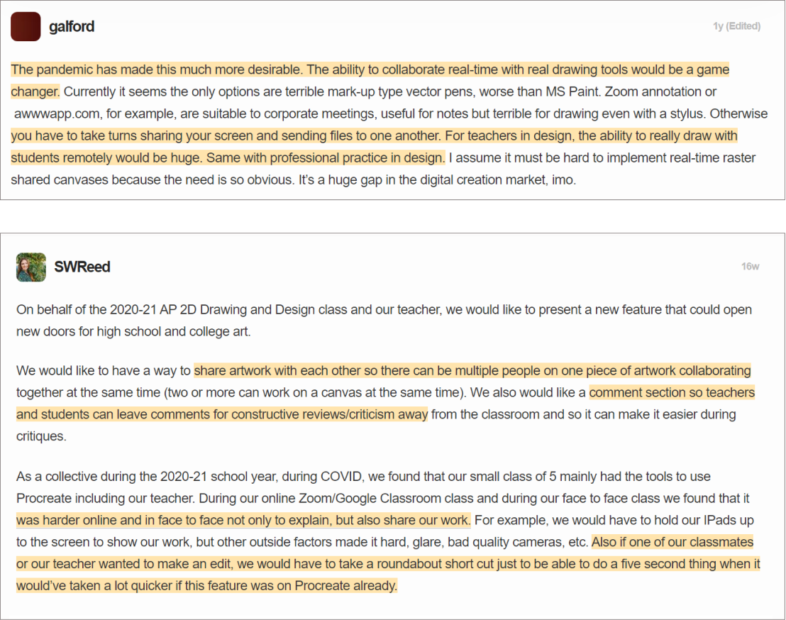
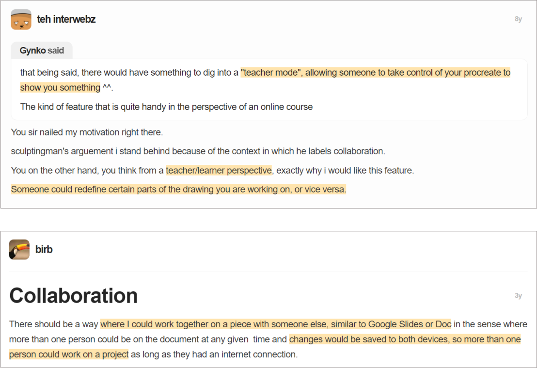
    Procreate forum
    Procreate forum users have requested collaboration features for years.

    What do users say?

    We released a Google Forms survey to various art-related and student-based online communities, and interviewed 8 people to gain qualitative insight into their experiences about collaborating on Procreate.

    Problems with Procreate Desires for Procreate
    Collaboration Abilities Single-user interface, no support for multi-user collaboration Live collaboration, "multiple people drawing" at the same time
    Sharing Files Send and download files, lots of “back and forth” and “waiting" Cloud storage, share across devices (desktop, iPad, non-Apple iOS)
    Tools & Features Lacks tools for collaboration, use other art programs Make editing suggestions with a “comment or [drawing] layer”

    How might we apply collaboration features to Procreate by utilizing familiar collaboration terminology, tools, and icons?

    Competitive Analysis

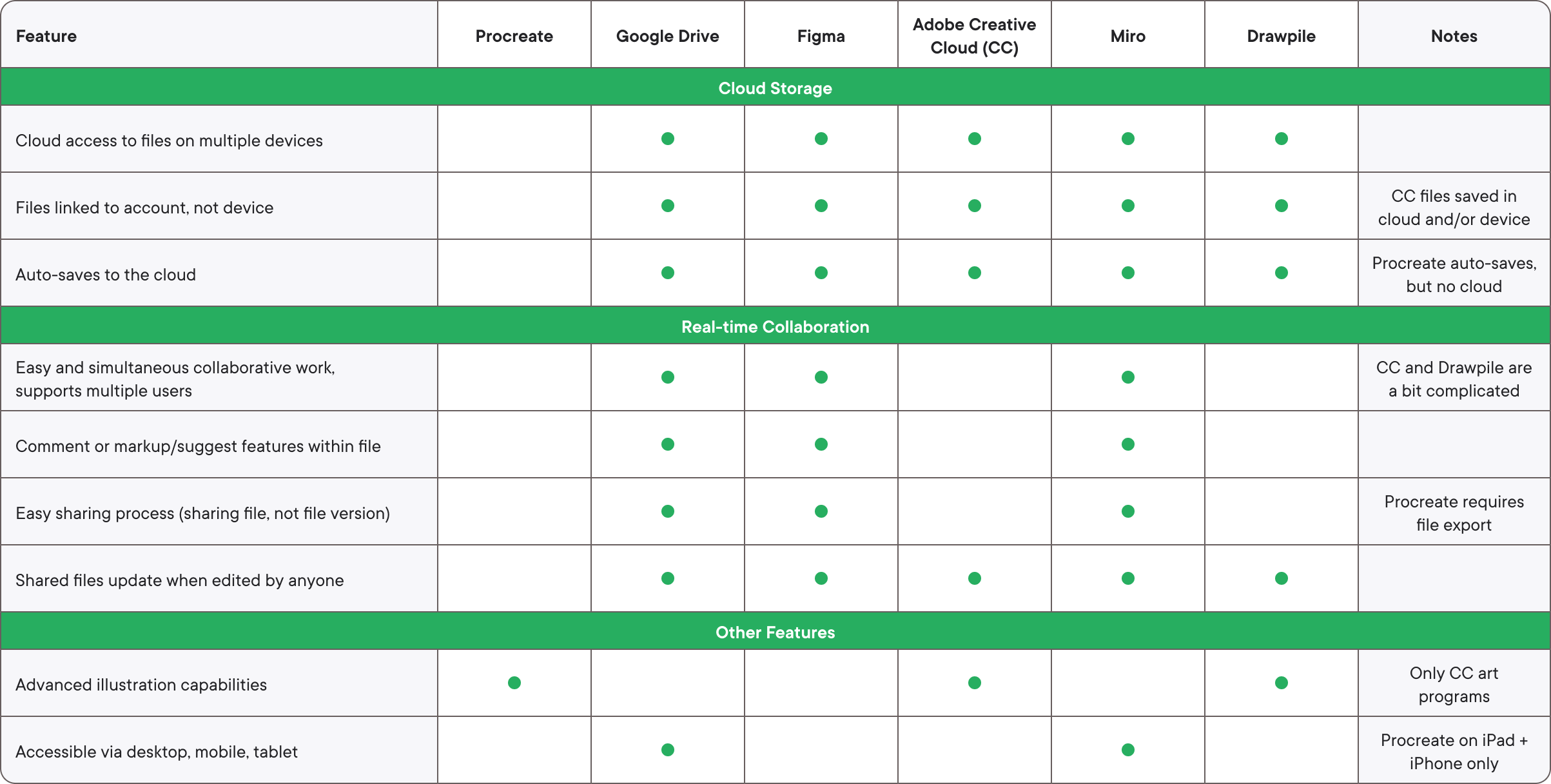
    We examined 5 programs that have cloud storage and real-time collaboration to identify how Procreate could be improved. Currently, Procreate is behind the industry standard for collaboration.

    Competitive Analysis

    Mapping out user flow and wireframes

    UX Flow

    Wireframes

    Wireframe: Open Comments tab
    Open Comments tab
    Wireframe: View new Comment on Canvas
    View new Comment on Canvas
    Wireframe: Reply to Comment
    Reply to Comment
    Wireframe: View Markup suggestion
    View Markup suggestion
    Wireframe: Share Procreate file
    Share Procreate file
    Wireframe: Auto-save to Cloud: first time pop-up
    Auto-save to Cloud: first time pop-up

    Lo-Fi Prototype Testing

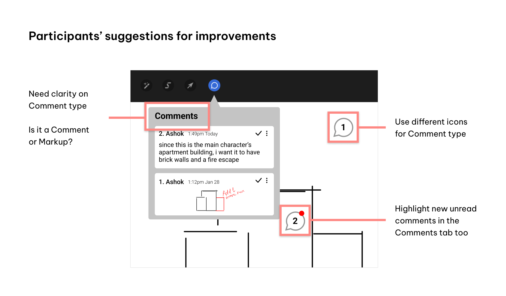
    We tested 3 participants (21-26 year old students) to help us refine our ideas. They provided suggestions for improvements, such as separating Comments and Markups for more clarity.

    Participants' suggestions for improvements

    Hi-Fi Prototype

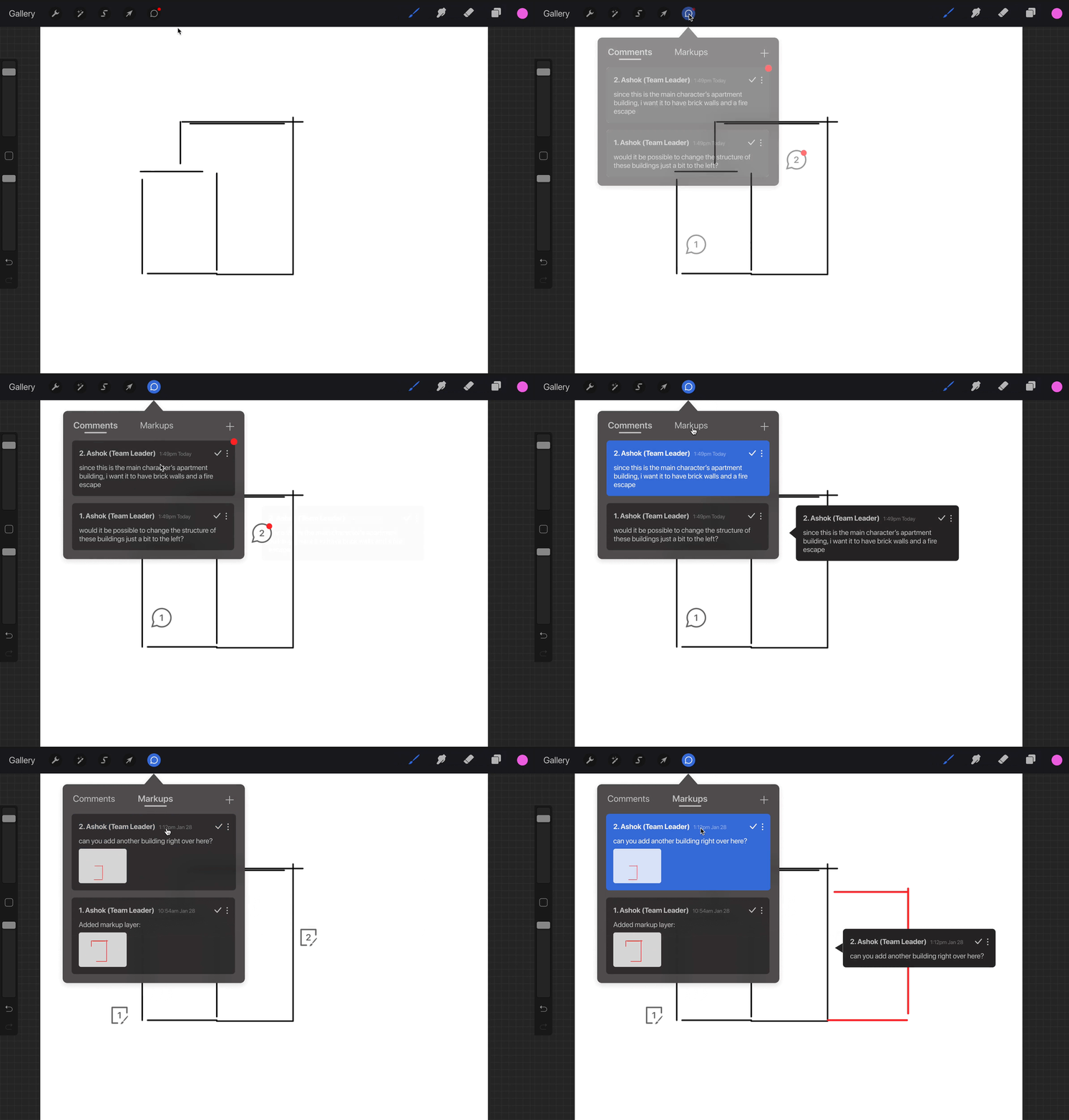
    Feedback is separated into Comments or Markups, which also have different representative icons (bubble or pen-paper).

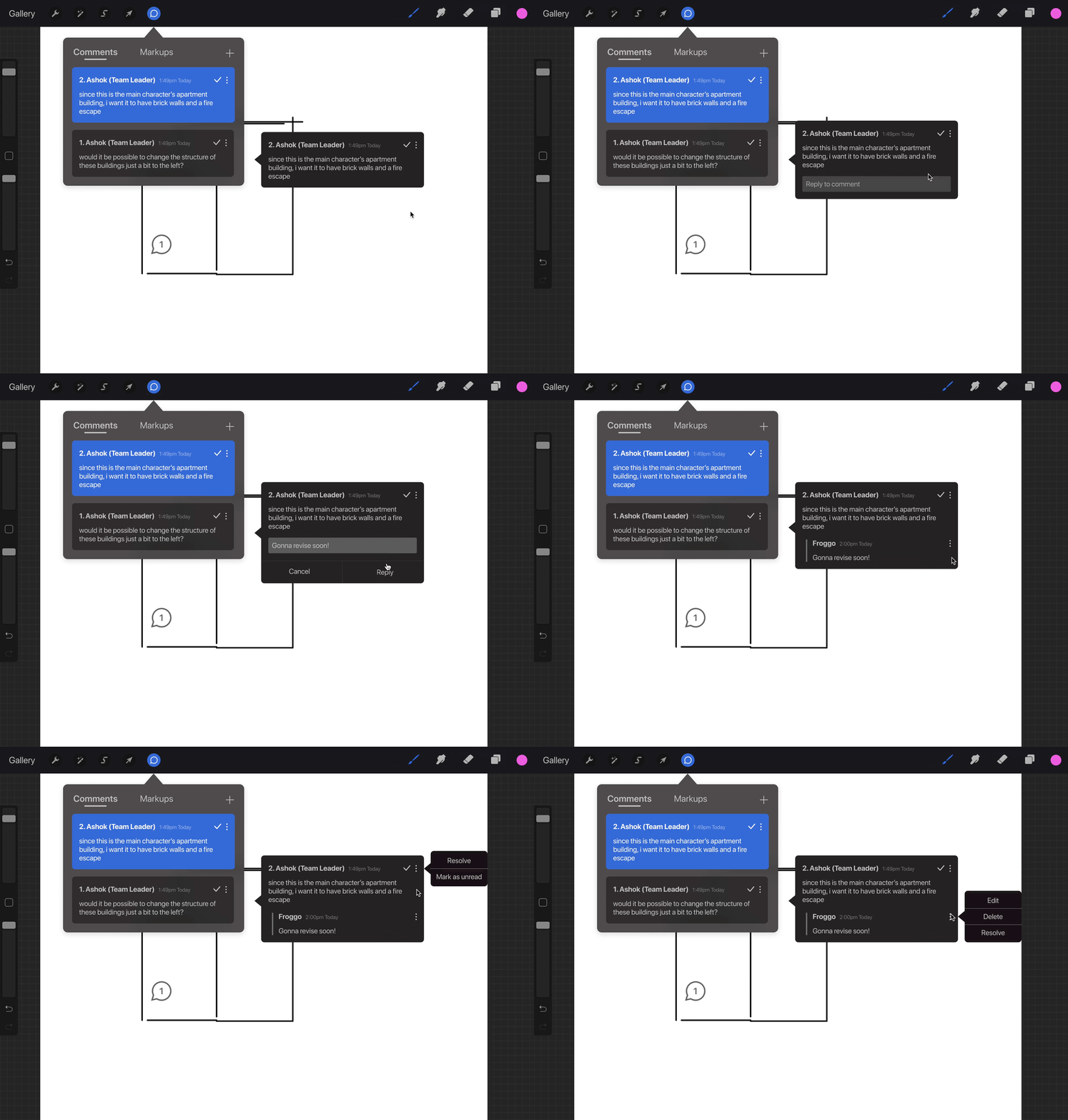
    Red dot = new feedback, blue highlights = selected item.

    Wireframe: Open Comments tab

    Comments and Markups can be replied to, resolved, marked as unread, deleted, and edited.

    Wireframe: Open Comments tab

    Click "+" to add a new Comment or Markup. Markup Layers, which serve as "suggested drawings", can be added as an official Layer to Procreate.

    Wireframe: Open Comments tab

    Revisiting the prototype

    A few months after finishing this project with my group, I revisited our Procreate design. We didn't quite achieve a final polished look for the hi-fi prototype, so I decided to refine it on my own so the design matched Apple's iOS UI design.

    Toggle Switch

    Before and After Comparison of Toggle Switch

    Comment Box

    Before and After Comparison of Comment Box

    Final Prototype

    Play Icon

    View prototype

    Procreate Final Comments gif
    Example of communication between team members
    Procreate Final Markups gif
    Example of a Markup superimposed over the illustration

    Reflection


    We relied on spoken and written accounts of how people collaborated, instead of observing how they did so or what the process looked like.

    Nonetheless, this project demonstrates how collaboration and communication tools could be brought into Procreate's workspace, turning an illustration program into one that supports multi-user teams.